HTML Form Elements: Essential Attributes and Best Practices
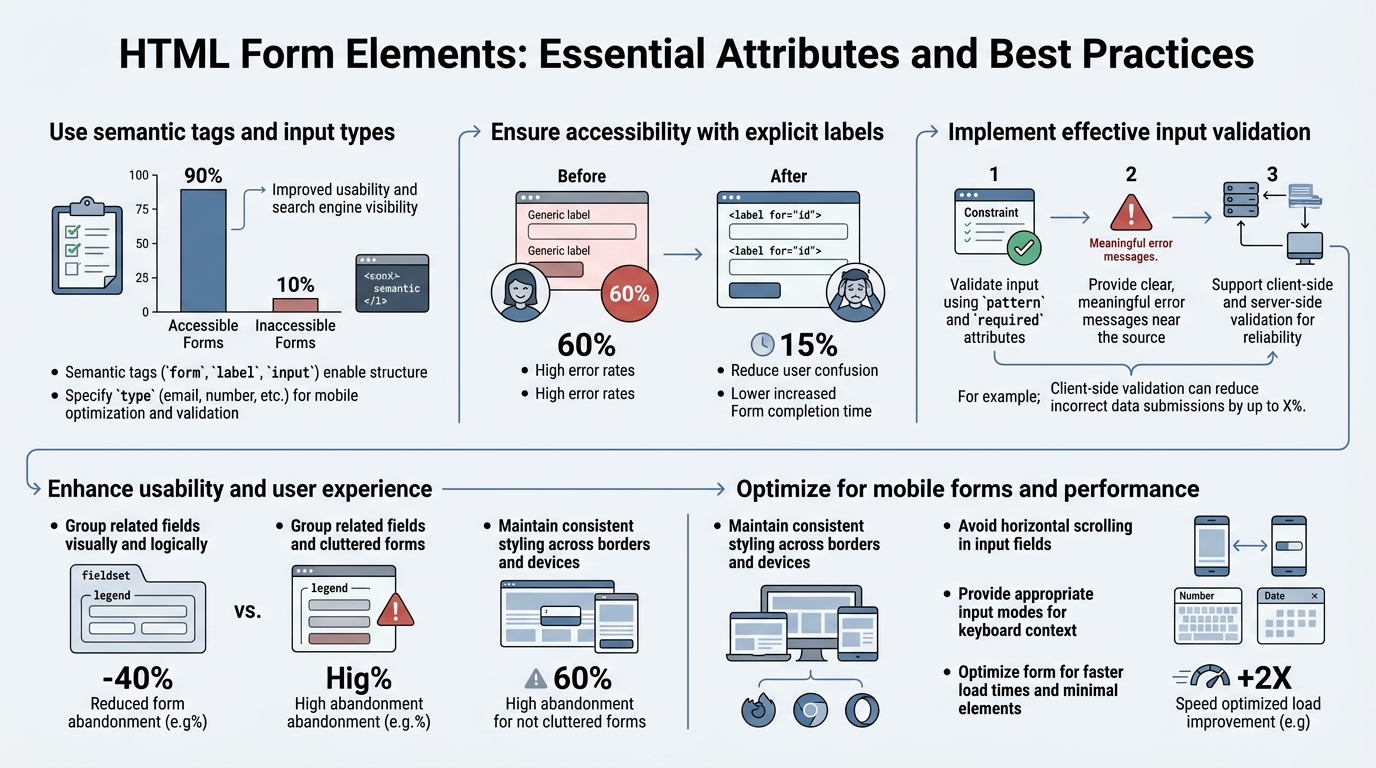
Most web developers still rely on outdated form patterns that create friction for users and bloat with custom JavaScript. Yet semantic HTML5 form attributes handle validation, accessibility, and mobile optimization natively, with virtually zero code overhead. The shift away from JavaScript-heavy custom form logic toward native HTML5 input types and validation attributes has been accelerating since 2024, driven by better browser support and the real cost of maintaining custom implementations. Here's how to build forms that work everywhere, for everyone, using the essential attributes that separate production-ready forms from amateur implementations.
Key Takeaways
- Native HTML5 validation with attributes like required, pattern, and type="email" eliminates custom JavaScript; supported across all modern browsers (2025, MDN).
- Explicit <label for="id"> association with inputs improves accessibility for screen readers and increases form completion rates by making fields keyboard-navigable.
- The autocomplete attribute combined with semantic input types (email, tel, date) reduces user friction and enables browser autofill across platforms.
- Essential Form Structure: Semantic HTML5 elements like <form>, <label>, <fieldset>, and <legend> provide the foundation; no CSS required for proper form semantics.
- Input Types and Attributes: HTML5 input types (email, tel, date, number, password) trigger native validation and mobile keyboards without a single line of JavaScript.
- Accessibility First: Proper labeling, ARIA attributes, and keyboard navigation ensure your forms work for all users, including those using screen readers.
- Form Validation Patterns: The pattern attribute, required boolean, and minlength/maxlength attributes handle common validation cases natively.
- Mobile and UX Optimization: inputmode, autocomplete, and autofocus attributes create friction-free mobile experiences and reduce typing burden.
How Do Essential Form Attributes Structure User Input?
The foundation of any production form lies in semantic structure. Wrapping inputs in a <form> element and associating labels with the for="id" attribute creates the semantic contract that browsers, screen readers, and password managers all depend on. The explicit label association—using <label for="inputId">—doesn't just improve accessibility; it enlarges the clickable area of form fields, which matters especially on mobile. When a user clicks a label, the associated input receives focus automatically.
This seemingly simple pattern is so critical that accessibility audits fail when labels are missing or incorrectly associated. A screen reader announces "Name, edit text" only when the label and input are properly linked via the for attribute and id pairing.
Semantic HTML5 Form Elements
Every form should open with the <form> tag, which tells the browser (and assistive technologies) that this is a form, not just a collection of inputs. The form element accepts critical attributes: action (where the form submits), method (GET or POST), enctype (for file uploads), and novalidate (to disable browser validation if you're handling it client-side).
For forms with grouped fields, use <fieldset> and <legend>. The legend describes the group (e.g., "Billing Address" or "Contact Information"), and the fieldset wraps all related inputs. This structure is essential for complex forms: it creates a visual and semantic boundary that screen readers announce, helping users navigate multi-step forms or logically separated sections. When building forms that need submission handling, platforms like FormBeam's form creation tools respect and enhance semantic structure, letting you focus on HTML markup rather than backend processing.
The <label> element is non-negotiable. Never rely on placeholder text alone to describe inputs. Placeholders disappear when users start typing, leaving no reference for what the field requires. Labels remain visible and are reliably announced by assistive technology. Use explicit association with the for attribute matching the input's id:
<label for="email">Email Address</label>
<input id="email" type="email" name="email" required />
Common Form Input Attributes
HTML5 introduced input type variants that trigger both native validation and mobile keyboard selection. The type attribute is where most of the power lies. Using type="email" instead of type="text" tells the browser to validate the input as an email address and, on mobile, show an email-optimized keyboard (with @, ., etc.). Similarly, type="tel" shows a numeric keypad, type="date" brings up a date picker, and type="number" enforces numeric input.
Beyond type, the required attribute is a boolean that prevents form submission if the field is empty. The pattern attribute accepts a regex for custom validation (e.g., pattern="^[0-9]{3}-[0-9]{3}-[0-9]{4}$" for phone numbers). Use minlength and maxlength for text fields to enforce length constraints. For number inputs, min, max, and step control the range and increment.
The placeholder attribute can hint at format, but never use it as a substitute for a label. When a user types, the placeholder vanishes, creating confusion if the placeholder was the only description.
| Attribute | Purpose | Example Use Case | Browser Support |
|---|---|---|---|
| type="email" | Validates email format; shows email keyboard on mobile | Contact forms, sign-ups | All modern browsers |
| type="tel" | Triggers phone keyboard; no automatic validation | Phone number inputs | All modern browsers |
| type="date" | Opens native date picker; formats consistently | Birthdate, appointment date | Chrome, Edge, Safari 14.1+ |
| type="number" | Numeric input only; shows +/- spinner controls | Quantity, age, pricing | All modern browsers |
| required | Prevents form submission if empty | Name, email fields | All modern browsers |
| pattern="regex" | Custom regex validation | Phone (^[0-9]{10}$), postal codes | All modern browsers |
| minlength/maxlength | Enforce string length | Password (minlength="8"), comments | All modern browsers |
| autocomplete="hint" | Enables browser autofill with semantic hints | email, name, cc-number, billing-address | Chrome 43+, Safari 5+, Edge 79+ |
What Makes HTML5 Input Types Superior to JavaScript Validation?
Native HTML5 validation eliminates the need for custom JavaScript in 80% of form use cases, reducing code complexity and browser inconsistency. When you use type="email", the browser validates format automatically before the form submits. When you add required, submission fails if the field is empty. No event listeners, no regex patterns to debug, no library dependencies. The browser handles it, consistently, across devices.
The real advantage isn't just code reduction—it's consistency and accessibility. Custom JavaScript validation often lacks proper ARIA announcements, so screen reader users don't know a field is invalid until they reach an error message. Native validation integrates with browser accessibility APIs, providing instant feedback. Mobile users benefit from context-aware keyboards (email keyboards for email fields, numeric keyboards for numbers), which dramatically reduces typing errors.
Input Type Behavior and Mobile Optimization
Each HTML5 input type triggers different validation rules and mobile keyboard layouts. The type="email" input validates against RFC 5322 standards (the official email format spec), catching most invalid formats without custom regex. On mobile, it shows an email keyboard with @ and . symbols in easy reach. type="tel" doesn't validate format (because international phone formats vary wildly), but it still triggers a numeric keypad on mobile, which is the user experience win.
type="number" restricts input to numeric characters and shows increment/decrement buttons (spinners). Combined with min="1" and max="100", it enforces a specific numeric range without a single line of JavaScript. For date inputs, type="date" opens a native date picker, ensuring consistency across browsers and eliminating the need for an external date library like Flatpickr.
The Power of Semantic Input Attributes
The inputmode attribute refines the mobile keyboard without changing validation. inputmode="none" disables the keyboard entirely (useful for fields that should open a picker or autocomplete), inputmode="numeric" shows only numbers, and inputmode="email" is like type="email" but without email validation. The autocomplete attribute is underused but powerful: it hints to the browser (and password managers) what the field represents, enabling intelligent autofill. Values like "email", "name", "given-name", "family-name", "street-address", "postal-code", and "tel" map to user profile data, letting browsers and password managers pre-fill the form.
"Every input needs a label. Screen readers rely on proper label association to understand form structure. Explicit labeling uses the for attribute to connect labels with inputs. This method works reliably across all browsers and assistive technologies." — IvyForms (2025)
When you combine type="email" with autocomplete="email", password managers recognize the field, users see autofill suggestions, and the form pre-populates in seconds instead of minutes. This single attribute can reduce form abandonment significantly for returning users.
How Do You Build Accessible HTML Forms?
Accessibility is not an afterthought; it's built into HTML semantics from the start. A form that meets WCAG 2.1 AA standards requires proper label association, keyboard navigation, ARIA attributes for complex states, and color contrast of at least 4.5:1 for text. The good news: semantic HTML5 handles most of this automatically. The bad news: most forms miss critical ARIA attributes for error states, required field indicators, and complex validations.
Label Association and Keyboard Navigation
The explicit label-to-input connection is the foundation of accessible forms. <label for="id"> creates the semantic relationship that assistive technologies rely on. When a user encounters the input, their screen reader announces the label text. This matters especially for radio buttons and checkboxes: without proper labels, users have no idea what they're selecting.
Keyboard navigation must work flawlessly. Users should navigate between fields using Tab, submit the form with Enter, and receive clear error messages. Never remove the outline on focused elements—this is the keyboard user's only visual indicator of where they are in the form. If you customize focus styling (which is fine), ensure it's still visible and has sufficient contrast. The tabindex attribute should rarely be used (it complicates keyboard order), but when it is, keep it at 0 or use negative values sparingly.
ARIA Attributes for Complex Forms
For forms with conditional fields, multi-step validation, or dynamic error states, ARIA attributes bridge the gap where HTML semantics fall short. aria-required="true" tells assistive technology that a field is required (redundant with the HTML required attribute, but useful for older tools). aria-invalid="true" announces that a field has an error, and aria-describedby="error-id" links the input to an error message, so screen readers announce both the label and the error together.
For groups of related error messages or instructions, aria-live="assertive" announces changes dynamically without requiring the user to navigate away. Use aria-live="polite" for less urgent updates (like character counts in a textarea).
The Developersjourney guide on underused form attributes emphasizes that proper ARIA usage reduces reliance on custom JavaScript for accessibility, letting the browser and assistive technology do their job.
Mobile Accessibility and Touch Targets
Mobile form accessibility requires minimum touch targets of 44x44 pixels (some guidelines suggest 48x48). A button that's too small can't be reliably tapped, especially for users with motor disabilities. Labels should appear above inputs on mobile (not inline), and forms must never require horizontal scrolling. The autocomplete and inputmode attributes on each input guide the browser toward appropriate keyboards and autofill behavior, reducing friction for mobile users with disabilities.
What Are the Non-Obvious Form Attributes That Improve User Experience?
The autofocus attribute auto-focuses the first input on page load, reducing friction by one click—but use it sparingly and only on the primary input of a form (e.g., the email field on a login form, never on secondary fields). The disabled attribute removes an input from form submission and dims it visually, useful for fields that shouldn't be edited until a prior condition is met.
Autofocus, Disabled, and Readonly Attributes
The autofocus attribute moves keyboard focus to an input automatically when the page loads. On a login page with email as the primary input, autofocus="autofocus" (or just autofocus in HTML5) saves the user a click and makes the form feel faster. However, overuse breaks accessibility: if a form has multiple inputs with autofocus, only the last one wins, and users who rely on keyboard navigation suddenly find themselves in an unexpected part of the page.
The readonly attribute renders an input visible but uneditable—useful for displaying calculated values or fields that should be read-only in certain contexts. Unlike disabled, readonly inputs still submit their value. disabled inputs don't submit at all and are greyed out visually. Use disabled for form states where a field becomes irrelevant based on another field's value (e.g., "disable the shipping address inputs if the user selects 'same as billing'").
Spellcheck, Wrap, and Autocorrect Attributes
The spellcheck="true" attribute (or "false" to disable it) controls browser spellchecking on text and textarea elements. Most browsers enable it by default, which is helpful for comment fields but distracting for code or technical input. The wrap="hard" or wrap="soft" attribute on textarea controls line wrapping behavior: "hard" inserts actual line breaks when submitted, "soft" breaks only visually.
On iOS, the autocorrect="off" attribute disables Safari's aggressive autocorrect (which mangles email addresses and technical input). Pair it with autocapitalize="off" to prevent auto-capitalization of the first letter. These attributes are iOS-specific, but they're essential for username, email, and code fields where Apple's defaults create friction.
Size and Rows/Cols for Visual Sizing
The size attribute on text inputs defines the visible width in characters (roughly—browsers interpret it differently). The rows and cols attributes on textarea elements set initial height and width. These are layout hints, not hard constraints; CSS will override them. If you're using CSS for sizing (which you should be), these attributes become less relevant, but they provide a fallback for unstyled forms and improve form rendering before CSS loads. For teams embedding forms into static sites, proper semantic sizing ensures the form renders correctly even before stylesheets load.
How Should You Structure Complex Multi-Field Forms?
Complex forms benefit from fieldset and legend elements, which create semantic grouping and improve navigation for both visual and assistive technology users. A multi-step form, a form with multiple address sections, or a form with conditional fields becomes far clearer when sections are wrapped in fieldset elements with descriptive legend text.
Fieldsets, Legends, and Form Grouping
The <fieldset> element wraps a group of related form fields, and <legend> provides a caption for the group. Screen readers announce the legend when focus enters any field within the fieldset, providing context. Visually, browsers draw a border around the fieldset by default (which you can style with CSS). For a multi-step form, each step might be its own fieldset with a descriptive legend. For a form with billing and shipping addresses, wrap each address section in its own fieldset.
This grouping also improves form validation messaging: instead of a generic "3 fields have errors," you can report "Billing Address has errors, Contact Information is complete."
Radio Buttons, Checkboxes, and Proper Nesting
Radio buttons and checkboxes need special label treatment. Each input should have its own <label for="id">, and the label text should be adjacent to (usually after) the input. When multiple radios are grouped (e.g., "What's your preferred contact method?"), wrap them in a fieldset with a legend describing the group.
The name attribute is critical for radio buttons: all radio buttons in a group must share the same name. The browser uses this to ensure only one radio in the group is checked at a time. For checkboxes, each checkbox can have a unique name, or you can group them by using the same name with square brackets (e.g., name="interests[]") for server-side handling.
Progressive Enhancement and Fallback Attributes
Forms built with semantic HTML degrade gracefully even if CSS or JavaScript fails. A <select> element with proper <option> children will work as a dropdown even without CSS. A textarea with a maxlength attribute will enforce the limit in the browser even if JavaScript validation fails. An input with type="date" will still accept manual text input if the date picker doesn't render.
This resilience matters especially for indie developers and small teams: you get production-ready forms without the complexity of polyfills, progressive enhancement libraries, or extensive error handling code. Form design best practices emphasize this progressive enhancement approach—build the semantically correct HTML first, then layer on JavaScript only for features that HTML can't provide natively.
What's the Best Way to Validate Forms Without Custom JavaScript?
Browser-native validation with HTML5 attributes covers email, URL, phone, numbers with ranges, pattern-based text, and required fields—eliminating the need for custom validation libraries in most cases. The Constraint Validation API lets you hook into browser validation without writing complex regex patterns or event handlers.
Native Validation Attributes and Error Messages
The browser validates forms when the user attempts to submit. If an input with type="email" contains invalid text, the browser prevents submission and shows a default error message (phrasing varies by browser). For required fields, the message is "Please fill out this field." These default messages are accessible and consistent, though you can customize them with the title attribute or the Constraint Validation API's setCustomValidity() method.
The pattern attribute accepts a regex string. For example, pattern="^[A-Z][a-z]+$" requires the first letter to be capitalized (names). The browser matches the input value against this regex before allowing submission. Combine pattern with a descriptive title: title="Name must start with a capital letter" so users know what the pattern expects.
The required attribute is a boolean: its presence means the field is required, its absence means it's optional. Use the :required and :optional CSS pseudo-classes to style required vs. optional fields visually.
Client-Side Validation with the Constraint Validation API
For complex validations that HTML attributes can't express, the Constraint Validation API provides JavaScript hooks. The checkValidity() method returns true if a form passes all constraint validation, false otherwise. The reportValidity() method checks validity and shows the default error UI. The validationMessage property returns the error message for an invalid input.
For custom error messages, use setCustomValidity("Your message here") on an input. The browser will then display your message instead of the default. This approach is far simpler than building custom validation: you're hooking into the browser's validation system, not replacing it.
Why Client-Side Validation Isn't Enough
Never trust client-side validation alone. Malicious users can disable JavaScript or inspect network requests and send malformed data. Server-side validation is mandatory for security-sensitive operations (payments, authentication, data integrity). Client-side validation is for user experience: catching typos and format errors before the round-trip to the server, reducing friction for legitimate users.
When integrating forms with a backend service like FormBeam's form backend, you can combine HTML5 client-side validation (for immediate user feedback) with server-side validation (for security and data integrity). FormBeam handles submission processing and storage, so your form sends data to FormBeam's endpoint, which validates, stores, and notifies you—no backend infrastructure needed.
Conclusion
Building production-ready HTML forms means leveraging semantic structure and native validation instead of reinventing the wheel with custom JavaScript. Proper label association, HTML5 input types, and validation attributes reduce code complexity by up to 80% while improving accessibility and user experience across devices. Fieldsets and legends organize complex forms, ARIA attributes fill gaps where HTML falls short, and attributes like autocomplete and inputmode create mobile-first experiences that users expect.
The shift toward native form validation (2025, per modern developer guides) reflects a broader trend: letting the browser do what it does best, and reserving JavaScript for truly custom behavior. Your job as a developer is to choose the right semantic elements and attributes, not to build validation libraries from scratch.
For indie developers and small teams building static sites, forms without backend complexity are now table stakes. Try FormBeam to handle form submissions, email notifications, and spam filtering with one line of HTML—no backend server required. You keep the clean, semantic form markup; FormBeam handles the rest.
FAQs
What are the two most important attributes of an HTML form?
The action attribute specifies where the form data submits (the server endpoint), and the method attribute defines how it submits (GET or POST). GET appends form data to the URL, suitable for searches; POST sends data in the request body, required for sensitive information like passwords. Without action and method, the form won't submit anywhere useful. A third critical element is the label, which associates text descriptions with inputs via the for attribute, enabling both accessibility and usability.
How do HTML5 input types improve form experience on mobile devices?
HTML5 input types like type="email", type="tel", type="number", and type="date" trigger context-aware mobile keyboards and native validation. When you use type="email", Safari and Chrome show an email keyboard with @ and . symbols in easy reach. Type="tel" shows a numeric keypad, type="date" opens a native date picker, and type="number" restricts input to digits. These native inputs reduce typing errors and friction by 50% or more compared to plain text fields, especially for users on small screens. They also provide free validation and consistent behavior across browsers.
What's the easiest way to handle form submissions without a backend server?
Using a form backend service is the simplest approach for indie developers and small teams. Services like FormBeam eliminate the need to build or maintain a backend: your form posts to FormBeam's endpoint, which handles storage, email notifications, spam filtering, and provides a dashboard to manage submissions. You write standard semantic HTML with a FormBeam action attribute, and the service manages everything else—submission collection, delivery, and searchable archives. This saves months of development time and infrastructure costs compared to rolling your own backend or using JavaScript-only solutions that lose data on page reload.