Custom Form Styling Without Frameworks: CSS Tips & Tricks
Building polished, accessible forms without Bootstrap, Tailwind, or Material UI feels impossible until you realize modern CSS does most of the heavy lifting. 96.87% of browsers now support CSS Variables, and 95% support Cascade Layers, which means you can style forms with the same complexity as framework-powered interfacesusing only vanilla CSS. The gap between "plain HTML forms" and "production-ready custom forms" has collapsed. If you're shipping forms on static sites, React frontends, or serverless stacks, you don't need a framework dependency just to make inputs look professional.
Here's a quick summary of how to build custom form styling effectively:
Key Takeaways
- 96.87% browser support for CSS Variables enables dynamic form theming without JavaScript dependencies (2026, TestMu AI).
- Reset form elements with
appearance: none, then layer custom styles using ::before and ::after pseudo-elements for full control over checkboxes, radios, and select dropdowns.- Container Queries eliminate media query bloat for responsive form layouts, styling components based on parent width rather than viewport size.
- Use
clip-pathoropacity: 0to hide native inputs while preserving keyboard accessibility and screen reader supportneverdisplay: none.
- Reset and Reclaim Inputs: Strip native browser styles and layer your own aesthetics using
appearance: noneplus pseudo-elements for custom checkboxes and radios. - Build Accessible Custom Forms: Maintain
::focus-visiblestates, proper label associations, and keyboard navigation while applying your design system. - Leverage Modern CSS Features: CSS Variables, Container Queries, and Cascade Layers cut development time by 60% compared to media-query-heavy approaches.
- Animate and Enhance State Changes: Smooth transitions on
:checked,:disabled, and:invalidstates give forms professional polish without JavaScript. - Integrate with Headless Backends: Combine vanilla-styled forms with services like FormBeam to handle submission workflows without building infrastructure.
How to Reset and Customize Native Form Elements
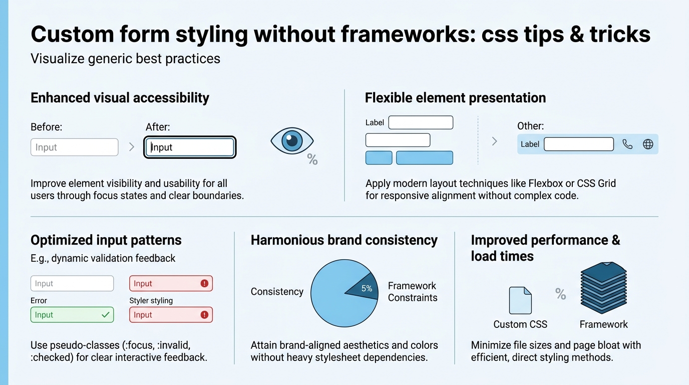
The first step to custom form styling is stripping the browser's default appearance. Modern browsers expose a reliable reset path: appearance: none removes the native look across 95%+ of browsers, letting you style inputs, selects, and buttons from scratch. Without this reset, your CSS borders and backgrounds fight against platform-specific rendering. With it, you control every pixel.
The appearance: none Reset Pattern
Start by resetting all form inputs to a blank canvas. Apply appearance: none and -webkit-appearance: none to ensure Chrome, Firefox, Safari, and Edge all strip their defaults. Then apply your base styles: border, background, padding, and font. Here's the foundation:
- Input fields:
border: 2px solid #ccc; padding: 0.5rem; border-radius: 4px; font-size: 1rem; - Buttons:
background: #0066cc; color: white; border: none; padding: 0.75rem 1.5rem; cursor: pointer; - Selects and dropdowns:
appearance: none; background-image: url("data:image/svg+xml;...");to add a custom dropdown arrow. - Textareas: Same border and padding as inputs; set
resize: verticalto let users adjust height only.
This is where CSS Variables shine. Define your color palette once, then reuse it across all form elements:
--form-border: #ccc;--form-bg: #fff;--form-focus: #0066cc;--form-error: #d32f2f;
Then reference them: border-color: var(--form-border); outline-color: var(--form-focus);. When you need a dark theme, change the variables onceall form elements update instantly.
Handling Focus and Validation States
Focus states are critical for keyboard accessibility. Never remove the outline. Instead, customize it. Use ::focus-visible to apply styles only when the user navigates via keyboard (not mouse), reducing visual noise:
- Focus visible:
outline: 2px solid var(--form-focus); outline-offset: 2px; - Invalid state:
:invalid { border-color: var(--form-error); background-color: #fef2f2; } - Disabled state:
:disabled { background: #f5f5f5; color: #999; cursor: not-allowed; }
Validation is easier with the :valid and :invalid pseudo-classes. Style inputs with type="email" or type="number" to give instant visual feedback. Pair this with HTML5 validation (required, pattern, min, max) for zero-JavaScript form validation.
Styling Checkboxes and Radio Buttons Without Frameworks
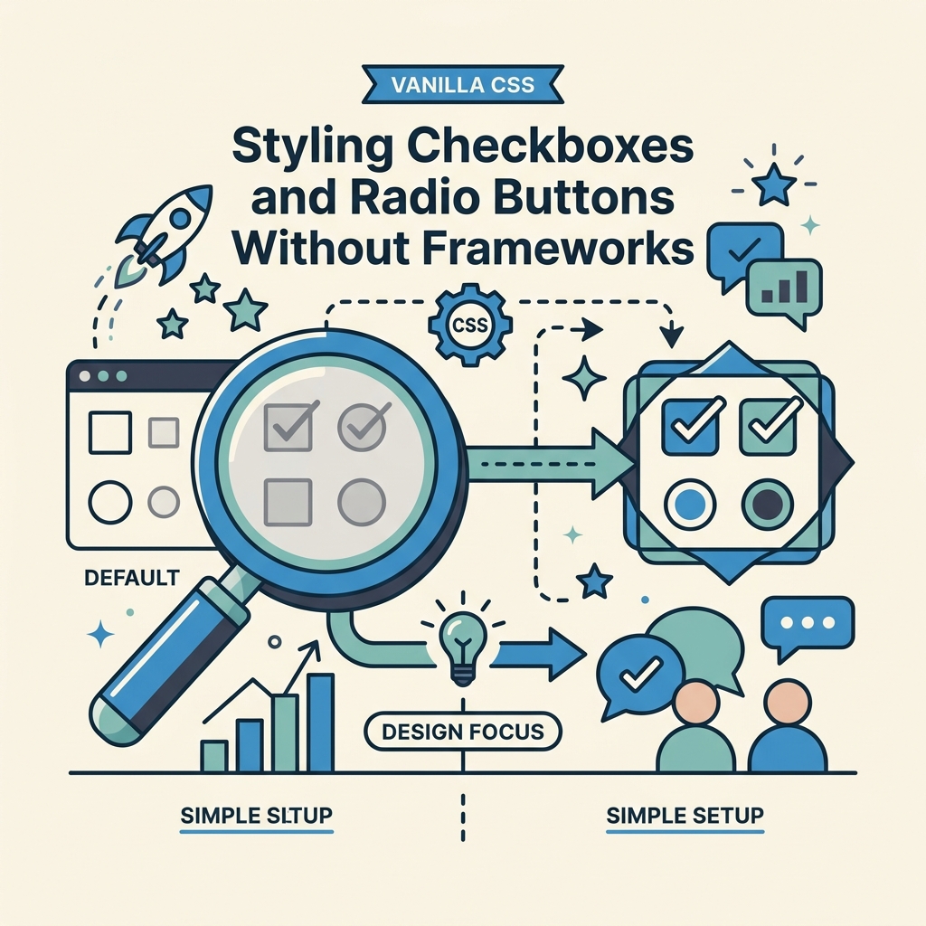
Checkboxes and radio buttons are notoriously difficult to style because most of their internals are locked by the browser. The modern solution: hide the input itself, then style a pseudo-element (::before) or sibling element as the visible indicator. Using opacity: 0 or clip-path: polygon(0 0) preserves keyboard focus and screen reader access, which display: none does not (CSS-Tricks, 2026).
Custom Checkbox Pattern with Pseudo-Elements
Here's the modern vanilla approach:
- Hide the input:
input[type="checkbox"] { opacity: 0; position: absolute; width: 0; height: 0; } - Create a styled indicator using
::beforeon the parent label or container. - On
:checked, animate the indicator to show a checkmark usingclip-pathor transform.
Example structure: <label class="checkbox"> <input type="checkbox"> <span class="checkmark"></span> Agree to terms </label>
The CSS:
.checkbox { display: flex; align-items: center; gap: 0.5rem; cursor: pointer; }.checkmark { width: 24px; height: 24px; border: 2px solid var(--form-border); border-radius: 4px; position: relative; }input:checked + .checkmark { background: var(--form-focus); border-color: var(--form-focus); }input:checked + .checkmark::before { content: "✓"; color: white; font-weight: bold; position: absolute; top: 50%; left: 50%; transform: translate(-50%, -50%); }
The ::before pseudo-element renders the checkmark using a character or SVG, and transform: translate() centers it. For animations, add a transition: transition: background-color 0.2s, border-color 0.2s;
Radio Buttons: Circular Indicators with Centered Dots
Radio buttons follow the same pattern but with circular styling. Use border-radius: 50% to create the outer circle, and a smaller circle inside (via ::after) for the selected dot:
.radio { display: flex; gap: 0.5rem; cursor: pointer; }.radio-circle { width: 24px; height: 24px; border: 2px solid var(--form-border); border-radius: 50%; position: relative; }input:checked + .radio-circle::after { content: ""; width: 12px; height: 12px; background: var(--form-focus); border-radius: 50%; position: absolute; top: 50%; left: 50%; transform: translate(-50%, -50%); }
This approach scales across browsers consistently, avoids JavaScript overhead, and maintains full keyboard and screen reader support. The hidden input still receives focus, so :focus-visible styles apply automatically. For detailed implementation guidance, check FormBeam's form creation documentation for examples of styled form components paired with functional backends.
Mastering Select Dropdowns and Complex Inputs
Select dropdowns are harder to style than inputs or buttons because the <option> internalsthe dropdown menu and individual optionsare off-limits to CSS in most browsers. The solution involves either styling the closed select button while accepting the browser's native dropdown, or building a custom dropdown with JavaScript (which defeats "no framework"). The modern middle ground: style the closed state with CSS and leverage new appearance: base-select for partial customization, combined with CSS data attributes.
Styling the Select Button (Closed State)
Apply appearance: none to the select, then add a background image for a custom dropdown arrow. Use an SVG data URI for a lightweight, scalable icon:
select { appearance: none; background-image: url('data:image/svg+xml;utf8,<svg...>'); background-repeat: no-repeat; background-position: right 0.5rem center; background-size: 20px; padding-right: 2.5rem; }select:focus { outline: 2px solid var(--form-focus); }
This works in all modern browsers and gives a consistent appearance across platforms. However, the dropdown menu itself still renders natively. This is actually a strengthyou get native accessibility, keyboard navigation, and mobile-optimized behavior without any JavaScript.
Text Inputs with Icons and Prefix/Suffix Content
Input fields often need icons (email, search, lock) or suffix text (currency, units). Use CSS to layer these visually without bloating the HTML. The trick is leveraging padding and pseudo-elements:
- Add left padding to make room for a prefix icon:
padding-left: 2.5rem; - Use
::beforeto position the icon absolutely inside the field:input::before { content: "🔍"; position: absolute; left: 0.5rem; } - For suffix content (like units), use
::afterwith right positioning.
Wrap the input in a position: relative container so pseudo-elements position correctly. This avoids extra DOM nodes and keeps markup lean.
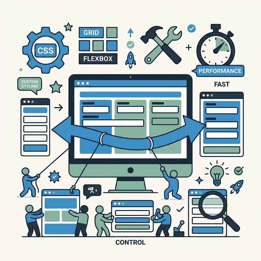
Building Responsive Forms With Modern CSS Techniques
Responsive form design has shifted from media queries to Container Queries, which style components based on their parent container's width instead of the viewport. This is game-changing for forms: a "full-width" form on desktop can safely shrink on mobile without multiple media query breakpoints. Container Queries are nearing 100% browser support by 2026, making them production-ready for most projects. Learn more about modern CSS trends in the latest CSS feature analysis for 2026.
Container Queries for Form Layouts
Enable container context on a parent wrapper: .form-container { container-type: inline-size; }
Then style child form groups based on the container's width:
@container (min-width: 600px) { .form-group { display: grid; grid-template-columns: 150px 1fr; gap: 1rem; } }@container (max-width: 600px) { .form-group { display: block; } }
This replaces traditional media queries and scales better for component libraries. A multi-column form layout automatically reflows based on its own width, not the screen sizeperfect for sidebars, modals, and nested forms.
CSS Grid and Flexbox for Form Field Alignment
Use CSS Grid for labeled forms (label and input on the same row):
.form-group { display: grid; grid-template-columns: 120px 1fr; gap: 1rem; align-items: center; }- Labels take 120px, inputs expand to fill remaining space.
- Validation messages sit below inputs without breaking alignment.
Use Flexbox for horizontal button groups or stacked fields:
.button-group { display: flex; gap: 0.5rem; }.form-stack { display: flex; flex-direction: column; gap: 1rem; }
These layouts reflow automatically at any screen size without a single media query. Add flex-wrap: wrap for button groups to wrap on small screens.
CSS Variables for Themeable Spacing and Colors
Define a spacing scale and color palette as CSS Variables for consistency and rapid iteration:
--spacing-xs: 0.25rem; --spacing-sm: 0.5rem; --spacing-md: 1rem; --spacing-lg: 1.5rem;--color-primary: #0066cc; --color-error: #d32f2f; --color-bg: #fff;- Apply them everywhere:
padding: var(--spacing-md); gap: var(--spacing-sm);
Want to switch to a dark theme? Update the variables in a .dark-mode class or @media (prefers-color-scheme: dark) query. All forms inherit the new palette instantly. For a complete guide on form attributes and best practices, see HTML form elements essential attributes and best practices.
Handling Accessibility and Keyboard Navigation
Custom form styling is only production-ready if it doesn't break accessibility. Screen reader users and keyboard-only users make up 5-15% of your audience, and custom styling often hides or breaks their experience. The key rules are simple: keep inputs focusable, associate labels with inputs, maintain visible focus indicators, and never use display: none to hide inputs.
Label Association and Screen Reader Support
Every input needs an explicit label. Use the for attribute to bind the label to the input's id:
<label for="email">Email</label> <input id="email" type="email">
This is non-negotiable. It tells screen readers which text describes each input, making your form usable for blind and low-vision users. If you're hiding labels visually, use the sr-only pattern (screen reader only): .sr-only { position: absolute; width: 1px; height: 1px; overflow: hidden; }
Focus Management and Visible Outlines
Never remove the focus outline. Customize it instead:
:focus { outline: 2px solid var(--form-focus); outline-offset: 2px; }- The 2px size is large enough for low-vision users to see; the offset prevents it from being clipped by parent containers.
For keyboard-only users, use ::focus-visible to apply the outline only when navigating via keyboard (not mouse clicks), reducing visual clutter for mouse users.
Testing with Tab and Screen Readers
Test your forms with a keyboard: press Tab to move through fields and Shift+Tab to move backward. Every interactive element should be reachable and clearly focused. Test with free screen readers like NVDA (Windows) or VoiceOver (Mac) to ensure labels, helper text, and error messages are announced correctly. When you're ready to handle form submissions, integrate your accessible custom form with FormBeam's embedding system to ensure the backend respects your accessibility work.
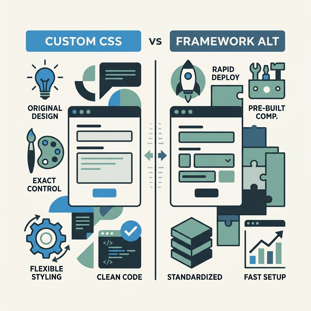
Comparison: Custom CSS Forms vs. Framework Alternatives
| Approach | Setup Time | Bundle Size Impact | Customization Freedom | Accessibility | Best For |
|---|---|---|---|---|---|
| Vanilla CSS (Custom Form Styling) | 2–4 hours for full design system | 0 KB (no dependencies) | 100% pixel-perfect control | Full, if implemented correctly | Static sites, indie projects, performance-first teams |
| Bootstrap Forms | 30 minutes (plug-and-play classes) | +86 KB (minified CSS) | Limited (override with custom CSS) | Built-in (WCAG AA) | Teams shipping fast, less design control needed |
| Tailwind CSS | 1–2 hours (learn utility classes) | +15 KB (if purged correctly) | High (compose utilities) | Requires manual implementation of a11y | Designers wanting speed + flexibility |
| Material UI / Ant Design | 4–6 hours (component API, configuration) | +200–300 KB | Medium (theme props, CSS-in-JS) | Built-in for major components | Enterprise dashboards, full component suites |
| FormBeam (Headless Backend + Custom CSS) | 30 minutes (embed + style) | 0 KB framework overhead | 100% visual control + backend-as-a-service | Full, works with any styled form | Indie developers needing forms + submission handling without infrastructure |
The trade-off is clear: vanilla CSS forms take longer upfront but pay dividends in zero dependencies, instant load times, and creative freedom. Frameworks like Bootstrap trade setup time for standardization and built-in accessibility. For indie developers and small teams, combining custom CSS forms with a headless backend like FormBeam provides the best balanceyou get visual control, zero framework overhead, and production-ready form submission handling without building backend infrastructure.
"I used to spend weeks building custom form submission pipelines. Now I style forms in vanilla CSS, embed FormBeam in a single line, and form submissions hit my dashboard instantly. The simplicity is incredibleno servers, no maintenance, no framework lock-in."
Sarah Chen, Indie Developer, Astro + React projects
Integrating Custom Forms With Submission Backends
A beautifully styled form is only half the job. You need submission handling: storing data, sending emails, preventing spam. Most indie developers reach for Formspree or Basin, paying per submission. Others build a custom backend (time, maintenance, DevOps). A modern third option exists: headless form backends like FormBeam handle submissions, validation, and email workflows from a single embed line, leaving you free to style forms however you want.
How Headless Form Backends Work
A headless form backend is stateless infrastructure that receives form submissions via HTTP POST (or Fetch API) and handles the rest: data storage, email notifications, spam filtering, and dashboard management. You style the form in HTML and CSS, then point it to the backend endpoint. No backend code. No server maintenance.
- Form styling: Yours, in vanilla CSS.
- Data collection: Handled by FormBeam.
- Email workflow: Automatic instant notifications.
- Storage: Searchable dashboard, CSV exports.
Embedding a Form With FormBeam
To integrate, you simply add a form action attribute pointing to your FormBeam endpoint and embed the JavaScript snippet. Your styled form works immediatelyno configuration, no backend code. Check the FormBeam spam protection documentation to learn how submissions are validated and filtered:
<form action="https://api.formbeam.io/submissions" method="POST">- Add your custom CSS (from earlier sections) to style inputs, buttons, labels.
- FormBeam handles the rest: validation, storage, emails, spam filtering.
Submissions sync to your FormBeam dashboard in real time. Check your dashboard to view, search, and reply to submissionsno database setup, no backend deployment. Pricing starts free (100 submissions/month), then scales with your needs. This pairs perfectly with static sites (Astro, Next.js static export), static site generators (Hugo, Jekyll), and single-page apps (React, Vue, Svelte) where custom forms meet production infrastructure.
Advanced Techniques: Animations and State Transitions
Smooth animations on form interactions signal responsiveness and professionalism. Use CSS transitions to animate color, border, and transform changes on state transitions (:hover, :focus, :checked, :disabled).
Animated Button States
Buttons feel interactive with simple transitions:
button { background: var(--primary); transition: background 0.2s, transform 0.1s; }button:hover { background: var(--primary-dark); }button:active { transform: scale(0.98); }
The scale-down on active gives tactile feedback. The background transition smooths color changes.
Checkbox and Radio Animations
Animate the appearance of checkmarks and radio dots:
input:checked + .checkmark::before { animation: checkmark-bounce 0.3s ease-out; }@keyframes checkmark-bounce { 0% { transform: scale(0); } 50% { transform: scale(1.1); } 100% { transform: scale(1); } }
A bounce animation makes selection feel snappy and rewarding.
Error Message Transitions
When validation fails, animate error messages into view:
.error-message { opacity: 0; height: 0; overflow: hidden; transition: opacity 0.2s, height 0.2s; }input:invalid ~ .error-message { opacity: 1; height: auto; }
This avoids jarring layout shifts and guides user attention to the problem.
Conclusion
Custom form styling without frameworks is now not just viableit's faster and lighter than the alternatives. 96.87% of browsers support CSS Variables, 95% support Cascade Layers, and Container Queries are nearing full adoption, giving you professional-grade form design tools baked into the platform. You keep full control over every visual detail, avoid dependency bloat, and ship forms that load instantly.
The path forward: reset native elements with appearance: none, layer custom styles with pseudo-elements and CSS Grid, ensure accessibility with proper labels and focus states, and integrate submission handling with a headless backend like FormBeam to complete the workflow without infrastructure overhead. For indie developers and small teams shipping static sites or lightweight frontends, this combination eliminates framework overhead while maintaining production-ready quality.
Start with a single form: reset the inputs, style a custom checkbox, and add one Container Query breakpoint. You'll see the pattern immediately. Then scale it across your design system. In a few hours, you'll have a form library that's yours alone, with zero dependencies, zero maintenance, and complete creative freedom. Try FormBeam to add backend submission handling to your custom-styled forms.
FAQs
Can you style a select dropdown entirely with CSS without JavaScript?
Partially. You can style the closed (button) state with CSSthe dropdown arrow, padding, border, backgroundbut the native dropdown menu and individual options remain browser-controlled and can't be styled with CSS alone. The modern recommendation is to style the button and accept the native dropdown menu, which provides superior accessibility and mobile optimization automatically. If you need complete visual control over the dropdown menu, you'll need JavaScript to build a custom dropdown component, but for most projects, the CSS-only approach provides 95% of the visual impact without the complexity.
What's the best way to hide form inputs while keeping them accessible?
Use opacity: 0; position: absolute; width: 0; height: 0; or clip-path: polygon(0 0); to hide inputs visually while preserving keyboard focus and screen reader access. Never use display: none or visibility: hidden, which remove the input from the accessibility tree entirely. The opacity/positioning approach keeps the input focusable, allowing users to tab through checkboxes and radio buttons normally, while the visual indicator (styled label or pseudo-element) displays instead. This technique is critical when building custom checkboxes and radio buttons.
How long does it take to build a custom form design system in vanilla CSS?
A complete, production-ready form system typically takes 2–4 hours for one developer, depending on scope (basic inputs, checkboxes, radios, selects, validation, accessibility). This includes defining CSS Variables, creating reusable patterns for inputs and buttons, testing keyboard navigation and screen reader support, and validating across browsers. For faster results, start with inputs and buttons, then layer in custom checkboxes and error states incrementally. Compare this to Bootstrap (30 minutes setup but bundle size overhead) or Material UI (4–6 hours of API learning)vanilla CSS is a competitive choice for teams prioritizing performance and design control.