Designing High-Response Survey Forms for Customer Insights
Only 1 in 3 people who start a survey actually finish it — a statistic that keeps customer research teams up at night. Yet survey fatigue, survey abandonment, and declining response rates aren't inevitable. The difference between a 5% response rate and a 45% response rate isn't luck; it's design. The right form structure, question sequencing, and UX decisions can lift completion rates from single digits to above 60%, transforming raw survey data into actionable customer insights. Here's how to design survey forms that your audience actually wants to complete.
Key Takeaways
- Response rates vary dramatically by channel: Email surveys average 5–15%, while in-app surveys hit 27.5% and SMS surveys reach 45–60% (Survicate 2025, Perspective AI 2026)
- Shorter surveys drive higher completion: Forms with 3–5 questions for feedback and under 10 questions overall can exceed 60% completion when paired with mobile-first design and progress indicators (Formbricks 2026)
- Mobile optimization is non-negotiable: A 3-second load delay on mobile can lose 20% of respondents before the first question loads; touch targets must be at least 44×44 pixels for comfortable interaction (2026 UX guidelines)
Quick-Scan Best Practices
- Define Clear Survey Goals Before Writing: Every question must map to a decision; eliminate items that don't inform action.
- Prioritize Mobile-First Form Structure: One question per screen, large tap targets, and minimal scrolling reduce friction and abandonment.
- Use Conditional Logic to Personalize Paths: Show only relevant questions to each respondent, reducing perceived effort by 30–50%.
- Set Time Expectations and Show Progress: Visible progress bars reduce abandonment by up to 15%; accurate completion-time estimates set realistic expectations upfront.
- Collect Data Immediately Upon Interaction: Context-triggered surveys (after purchase, support case, or app event) outperform standalone email campaigns by 2–3x.
How Does Question Count Impact Survey Completion?

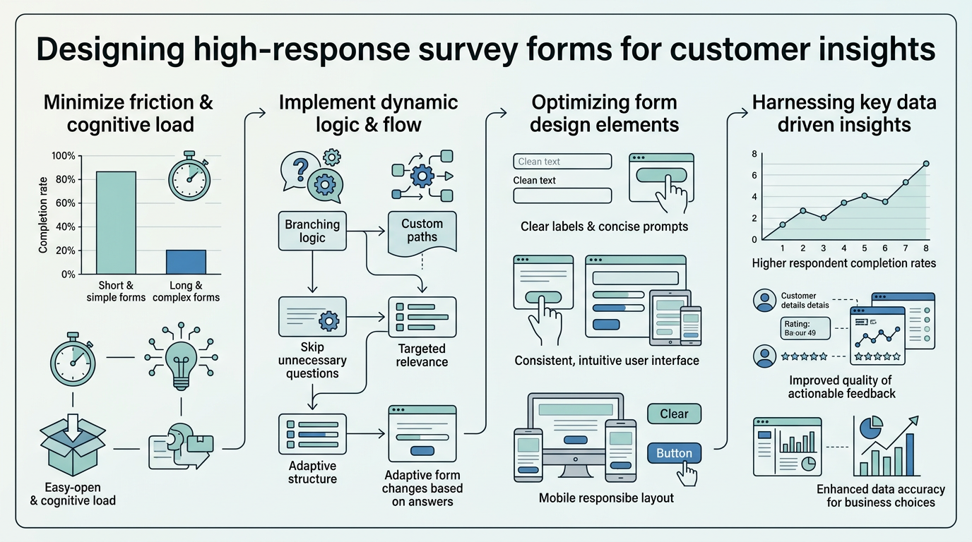
The single most predictable lever for completion rate is question count. Forms with 3–5 questions for pure feedback collection can achieve 85%+ completion, while surveys that exceed 15 questions see sharp drop-off regardless of topic relevance. The reason isn't psychology; it's friction. Every additional question adds perceived effort, increases decision fatigue, and creates another abandonment point.
The 3-to-10 Question Sweet Spot
SurveyMonkey's best-practices guidance recommends aiming for a one-page survey with 10 or fewer questions, while Shopify advises keeping customer surveys to 10–15 questions maximum. For quick feedback forms (NPS, CSAT, product feedback), the ceiling is even lower. Research from 2026 form-design sources shows that forms with 3–5 targeted questions combined with an accurate time estimate and easy first question can push completion rates above 60%. The key is ruthlessness: if a question doesn't inform a specific decision, remove it. This isn't about being lazy with research—it's about respecting respondent time and maximizing data quality over volume.
"When embedding feedback forms directly into your site, starting with a minimal question set and expanding only as research goals clarify ensures you're not wasting respondent time or creating unnecessary friction. Every question added reduces your completion rate—measure the value of each one before deploying at scale."
When embedding feedback forms directly into your site, tools like FormBeam's form creation interface make it easy to start minimal and add depth as research goals clarify.
Progressive Profiling and Multi-Touch Feedback
When your survey goals demand depth, progressive profiling spreads collection across multiple touchpoints. Instead of a 20-question form that 10% of people finish, deploy three 5-question micro-surveys at different interaction points (onboarding, feature usage, renewal). This approach maintains above-50% completion per survey while gathering richer longitudinal data without survey fatigue. FormBeam's submission dashboard consolidates all responses across multiple forms, making it simple to track patterns and segment feedback by survey version or respondent group. This eliminates manual export-and-consolidate workflows and lets you see insights faster.
What Mobile-First Design Elements Maximize Engagement?
Mobile now drives over 60% of survey traffic in 2026, yet most teams still design surveys on desktop and "adapt" them for mobile after the fact. The result is thumb-hostile touch targets, forms that demand pinch-to-zoom, and questions that span three screens worth of scrolling. True mobile-first survey design treats mobile as the primary experience and adjusts only upward for desktop.
Touch-Friendly Interaction Patterns
Usability standards set 44×44 pixels as the minimum comfortable touch target size, yet many survey tools ship with 30×30-pixel radio buttons and tiny checkboxes. A single misclick compounds abandonment—respondents who tap the wrong answer and have to start over often exit rather than correct the mistake. Button states matter too: visual feedback (color change, checkmark animation) confirms the selection and builds momentum. Avoid text input on mobile wherever possible; multiple-choice, slider scales, and dropdown selections reduce keyboard friction and load time. When open-ended text is necessary, preview the actual mobile keyboard type—email fields should trigger the email keyboard, numbers should trigger numeric input, and phone fields should open the phone keypad. Forms that respect these patterns see measurable completion lifts compared to ones that ignore mobile context.
"Mobile interaction patterns aren't optional luxuries—they're the difference between a 20% completion rate and a 50% completion rate. Respondents on mobile devices have less patience for friction, less screen real estate for errors, and higher expectations for speed. Design for mobile first, and desktop adapts naturally."
One-Question-Per-Screen Principle
Jotform's conversational form design guidance emphasizes that each screen should serve a single job: ask one question and receive one answer. This pattern dramatically reduces cognitive load on mobile and creates a sense of progress—respondents see visible forward momentum with each tap. Pagination also improves accessibility for respondents using screen readers and reduces the perceived question count. A 10-question form presented as 10 screens feels more manageable than a single long scroll, even though the question count is identical. Load time between pages matters; surveys that take more than 3 seconds per page transition see measurable abandonment spikes. Embedding fast-loading forms on static sites—whether built with React, Vue, Next.js, or plain HTML—requires clean backend handling to avoid latency.
How Can Conditional Logic Reduce Survey Fatigue?
The average person receives multiple surveys per week across their online touchpoints—from email, to in-app, to SMS. Survey fatigue is the result. One proven antidote is conditional logic (also called branching or skip logic), which hides irrelevant questions and tailors the form to each respondent's path. A respondent who answers "no" to "Do you use feature X?" simply doesn't see the five follow-up questions about that feature. Perceived effort drops, completion rates rise.
Branching for Relevance and Speed
Conditional logic reduces the effective question count for each respondent without reducing the survey's total depth. A 15-question survey with smart branching might present only 6–8 questions to any single respondent, depending on their answers. This can reduce perceived effort by 30–50% and directly improve completion. The psychology here is powerful: respondents feel the form is "designed for them," not a generic dump of questions. Implementation is straightforward in modern survey and form tools—Formbricks, Jotform, and similar platforms offer drag-and-drop branching logic without code. Indie developers building static sites can integrate conditional survey logic directly into HTML with minimal JavaScript, or use a backend form service to handle submission logic and analyze conditional paths. Understanding which question branches drive conversions helps teams optimize follow-up messaging and auto-routing.
Dynamic Scoring and Personalized Follow-Up
Beyond skip logic, conditional branching can power dynamic scoring. An NPS survey that branches to different follow-up questions based on score (detractors get "What would improve your experience?" while promoters get "What should we build next?") yields richer, more actionable qualitative data. This approach also allows teams to auto-route submissions to the right owner—support cases go to the support team, feature requests go to product, and bug reports go to engineering. When forms auto-funnel submissions based on answers, teams close the loop faster and respondents feel heard. Robust form validation and submission handling ensures that complex branching workflows don't drop or corrupt data mid-process.
What Role Does Survey Context and Timing Play?
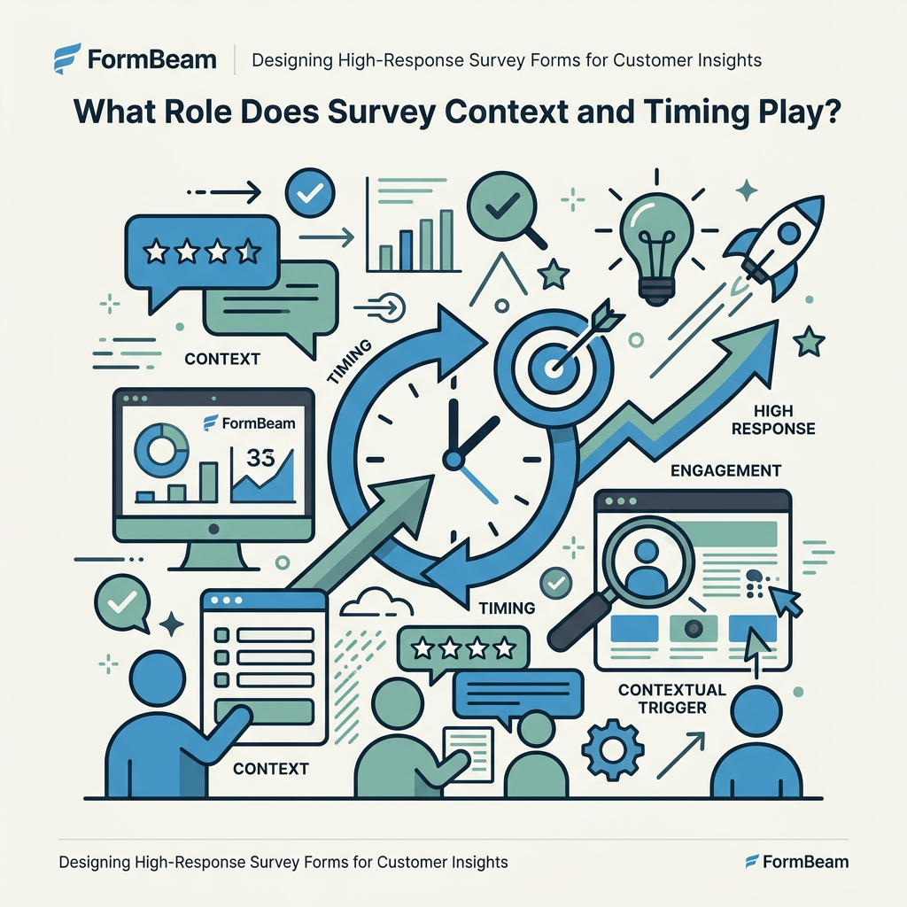
The same survey deployed via email achieves 5–10% response, but deployed in-app immediately after a support interaction achieves 35–50% response. Context matters far more than the question set. In-app surveys capture 27.5% response rates on average, compared to 6–15% for email surveys, because respondents are already engaged in the product and the feedback request is timely and relevant. Timing is where static surveys fail and context-triggered forms succeed.
Moment-of-Interaction Feedback Collection
The best surveys are invisible until the exact moment they're useful. Deploy feedback forms after a purchase, right after a support ticket closes, following a video tutorial, or after a user completes a key workflow step. The respondent's memory is fresh, their emotional response is authentic, and they're already in your product or email—no extra click-through required. This is why in-app surveys and post-interaction email triggers outperform "send a survey every month" cadences. Teams using context-triggered forms report 3x higher response rates than batch email campaigns, even with lower send volumes. Sites built on static-site frameworks (Next.js, Netlify, Vercel) can embed lightweight survey triggers without database dependencies by using event listeners and a backend form endpoint.
Setting Expectations with Completion Time and Purpose
Lead every survey with a statement that sets expectations: "This 2-minute survey helps us improve [specific feature]" works better than "Customer Feedback Survey" because respondents understand the value exchange. Accuracy matters—if you say 2 minutes and the survey takes 5, abandonment increases. Progressive disclosure of time commitment also helps: "4 quick questions" feels shorter than "4-minute survey," even though they're the same length. Add a visible progress bar on multi-page surveys; visible progress reduces abandonment by up to 15% by creating psychological momentum and certainty about remaining effort.
How Should Survey Questions Be Sequenced and Structured?

The order of questions isn't neutral. Starting with a difficult, open-ended question cuts completion in half compared to starting with an easy multiple-choice. This is why top-ranking forms follow a deliberate question hierarchy: begin with the easiest question to build momentum, progress through related items with increasing complexity, and reserve open-ended items for the end (where abandonment is expected anyway). Structure matters too.
Opening Questions and Momentum
Start with a low-friction multiple-choice question that almost everyone can answer confidently. An NPS scale (1–10) or a simple "Yes/No" works better than "Please describe your experience in detail." The first question sets the tone and builds early commitment—once a respondent has answered one question, they're more likely to answer the next. Momentum compounds. Save demographic questions for later in the form; asking for email, name, or company upfront introduces friction and can cause pre-question abandonment. By the time respondents reach demographic items, they've already invested effort and are more likely to complete.
Question Phrasing and Response Option Design
Closed-ended questions (multiple choice, scales, yes/no) drive higher completion than open-ended text. This isn't a limitation—it's a feature. Respondents can answer a Likert scale in 2 seconds but need 20 seconds to compose a text response. When qualitative depth matters, deploy open-ended questions selectively—after establishing quantitative signals with closed questions. For any response scale, ensure labels are clear and mutually exclusive. A 1–5 scale should define what 1 and 5 mean; "Strongly Disagree" to "Strongly Agree" is clearer than unlabeled numbers. Radio buttons (single select) work better than dropdowns on mobile; dropdowns require two taps, while radio buttons are single-tap selections.
| Survey Channel | Typical Response Rate | Best Use Case | Recommended Question Count |
|---|---|---|---|
| Email Survey | 5–15% | Periodic feedback, longitudinal tracking | 3–7 questions |
| In-App Survey | 20–35% | Real-time feedback, feature-specific | 2–5 questions |
| SMS Survey | 45–60% | Urgent feedback, quick polls | 1–3 questions |
| Post-Purchase Email | 15–25% | Transactional satisfaction (CSAT) | 3–5 questions |
How Do You Measure and Optimize Survey Form Performance?
Designing a high-response survey isn't a one-time effort; it's an iterative process informed by abandonment data, completion metrics, and respondent feedback. Without measurement, you're guessing. The most advanced teams track completion rates by question, abandonment points, and time-to-completion to identify friction.
Abandonment Analysis and Heatmaps
If you see a 50% drop-off after question 5, that's a signal—either the question is confusing, or the branch logic isn't working. Modern survey platforms offer abandonment heatmaps that show exactly where respondents exit. Some tools visualize the percentage of respondents who complete each question, making friction visible. Storing all submissions in a searchable database—rather than scattering them across email inboxes—lets you filter responses by completion status, review partial submissions, and export data for deeper analysis. This granularity allows product teams to iterate—if question 3 is causing 20% abandonment, reword it, simplify the options, or test a different question type in a follow-up batch.
A/B Testing Form Elements
Deploy two versions of a form (different wording, different question order, different response scales) to random subsets of respondents and compare completion rates. A/B testing removes guesswork from optimization. Do NPS scales outperform 5-star ratings for your audience? Does a 30-second intro video increase or decrease completion? Does asking for email upfront reduce completion compared to asking at the end? Answers depend on your specific audience and context, and A/B testing reveals them. Even small wins compound: if a wording change lifts completion from 40% to 45%, and you deploy the form to 1,000 respondents, you've captured 50 additional responses for the same effort.
What Technical Considerations Ensure Reliability and Trust?
High-response surveys depend on technical foundation as much as design. A form that times out, doesn't submit, or exposes respondents' data erodes trust and kills future response. Security, speed, and reliability are non-negotiable.
HTTPS, Privacy, and Data Handling
Every survey should run over HTTPS and clearly display trust signals: privacy policy link, data retention statement, and opt-out instructions. Respondents who worry their feedback will be tied to their identity or misused are more likely to abandon or give false answers. GDPR, CCPA, and similar regulations require explicit consent for data collection and email follow-up. Forms that demand email without explaining why it's needed see higher abandonment. Be transparent: "We'll email your results in 7 days" or "Your name helps us follow up on your feedback" explains the value exchange.
Form Submission Reliability and Error Handling
A form that drops submissions, doesn't acknowledge completion, or throws cryptic error messages destroys credibility. After a respondent invests 5 minutes answering questions, a "Submission failed" message is infuriating. Build in submission confirmation: a thank-you screen, a confirmation email, or both. Errors should be specific ("Please enter a valid email" not "Error: Invalid input") and recoverable (users shouldn't lose their answers if one field is wrong). Backend form services handle submission validation, storage, and retry logic transparently, ensuring that even if a network hiccup occurs, the submission is captured and the respondent sees a success message. This reliability is critical when surveys are deployed across multiple devices and network conditions.
Key Optimization Checklist
- Start with 3–5 questions for transactional feedback: NPS, CSAT, and quick product feedback should never exceed this range without compelling research justification.
- Deploy surveys at moment-of-interaction: After purchase, support completion, or feature adoption, response rates triple compared to email-only cadences.
- Design for mobile-first, mobile-only interaction: 44×44px touch targets, one question per screen, and zero pinch-to-zoom requirements are non-negotiable.
- Use conditional logic to reduce perceived effort: Show only relevant questions; branching can reduce the effective question count by 30–50% while maintaining research depth.
- Set clear time and purpose expectations: "2-minute survey to improve checkout" beats "Customer Feedback Survey" every time.
- Add visible progress indicators: Progress bars reduce abandonment by up to 15% by creating psychological momentum.
- Measure abandonment by question: If any single question causes 20%+ drop-off, reword, retype, or remove it.
- A/B test question wording and order: Small wins in phrasing compound into 5–10% completion lifts when scaled across your audience.
Conclusion
High-response survey forms are the result of deliberate design choices, not luck. By prioritizing mobile-first structure, keeping question counts ruthless, using conditional logic to personalize respondent paths, and deploying surveys at moment-of-interaction, teams can lift response rates from 5–10% to 45–60% and transform survey data from vanity metrics into actionable customer insights. The technical foundation matters too—reliable submission handling, clear privacy messaging, and fast load times ensure respondents follow through on their intent to complete. Start with a single survey form optimized for your core feedback use case (NPS, CSAT, or feature feedback), measure abandonment at each step, and iterate. The investment in form design returns dividends in data quality and volume.
FAQs
What is a good survey response rate?
A good response rate depends entirely on your channel and audience. Email surveys typically range from 5–15%, in-app surveys from 20–35%, and SMS surveys from 45–60%. For external customer surveys sent via email, a response rate above 15% is considered strong; for embedded feedback forms triggered within your product, 30%+ is achievable and expected. The most useful benchmark isn't a single industry average but a channel-specific one matched to your own baseline. If your email NPS survey historically achieved 8%, aiming for 12% on the next deployment is a realistic and valuable 50% improvement.
How many questions should a survey have?
For maximum completion rates, keep surveys to 3–5 questions for transactional feedback (CSAT, NPS) and under 10 questions for deeper research. Each additional question reduces completion rate; a 15-question survey loses roughly half the respondents compared to a 10-question survey. If your research goals demand depth, deploy multiple shorter surveys at different touchpoints rather than one long form. This progressive profiling approach maintains high completion rates on each survey while gathering richer data over time without triggering survey fatigue.
Why do survey response rates keep declining?
Survey fatigue, email overload, and poorly designed forms are the primary drivers of declining response rates. The average person receives multiple survey invitations per week, and low-quality surveys (too long, poorly timed, not mobile-friendly) train respondents to ignore them. Response rate decline is reversible: shifting from email-only surveys to context-triggered, embedded forms; cutting question count; and optimizing for mobile can easily triple response rates compared to legacy approaches. The teams seeing 40%+ response rates in 2026 aren't using generic survey platforms—they're deploying targeted, moment-of-interaction feedback at the exact moment respondents are engaged.