Form Completion Rate Benchmarks: What's Normal for Your Industry
Form completion rates are the hidden metric that determines whether your traffic converts or disappears. A page that attracts qualified visitors can still leak 80% of intent at the form submission step. Understanding where your forms stand relative to industry benchmarks isn't vanity—it's your first map of where revenue is slipping away. The median form completion rate across industries sits at 17.3%, but this number masks dramatic variation: ecommerce checkout forms convert at 28.4%, while financial services barely reach 5.4%. For developers and small teams building forms on static sites, knowing these benchmarks reveals whether your form mechanics are competitive or if they're silently hemorrhaging conversions.
Key Takeaways
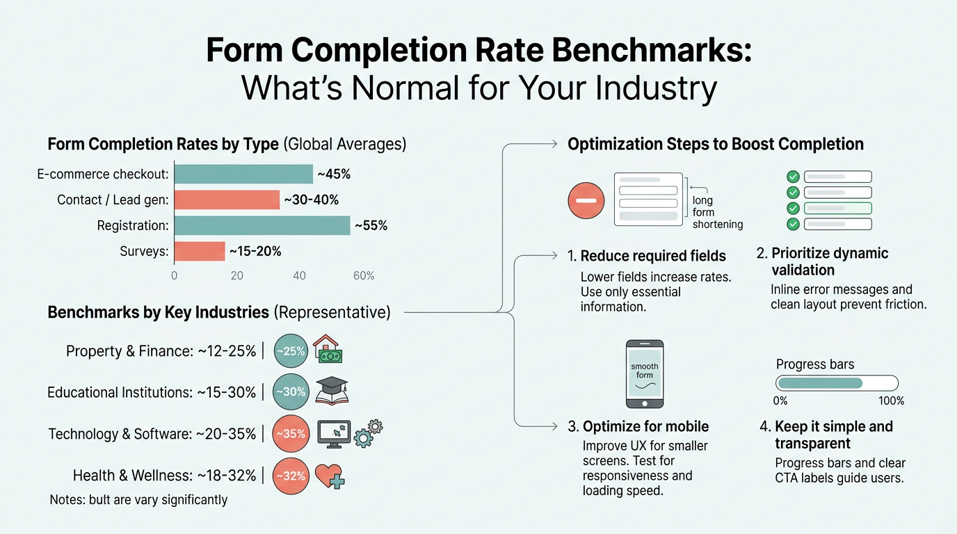
- Median form completion rate is 17.3% across all industries, but ranges from 5.4% (financial services) to 28.4% (ecommerce checkout) depending on sector and form type (Digital Applied, 2026).
- Forms with 5–7 fields hit a critical threshold where each additional field costs 2.8% in conversion, compared to 1.5% below 5 fields.
- Multi-step forms outperform single-page equivalents by 14% on average, with lead-gen forms seeing 21% lifts by reducing perceived friction.
- Industry Benchmarks Matter: Your form's performance depends entirely on industry type, field count, and traffic source—a 3-field newsletter signup isn't comparable to a 10-field demo request.
- The Field Count Cliff: Conversion rates collapse between 5 and 7 fields; every field beyond that costs approximately 2.8 percentage points.
- Multi-Step Design Lifts Conversion: Breaking forms into 2–3 steps boosts completion by 14% on average, with lead-gen forms seeing 21% improvements.
- Mobile Conversion Gap: Mobile lead-gen forms convert 32% below desktop rates, signaling a major optimization opportunity.
- Validation Prevents Abandonment: Real-time field validation lifts completion 5–13% by eliminating the frustration of submit-and-retry cycles.
What Form Completion Benchmarks Actually Measure
Form completion rate is the percentage of users who fully submit a form after opening it. This metric is calculated by dividing completed submissions by total form starts, then multiplying by 100. The number matters because it isolates friction at the form itself—a metric that most analytics tools ignore. Unlike overall site conversion (which includes all the traffic that never reaches the form), form completion rate focuses only on visitors who engaged with your form. This makes it simultaneously more and less useful: more useful because it pinpoints exactly where the funnel breaks, less useful because external factors (traffic quality, offer clarity, page design) all compress into one number. According to Digital Applied's comprehensive 2026 benchmark study, the median completion rate across all qualified visitors reaches 17.3%, marking a critical baseline for comparison across industries.
"The 17.3% median baseline represents forms displayed to qualified traffic. If your form never gets seen, this number doesn't apply. But the moment a visitor clicks into a contact form, signup field, or checkout page, you're competing against that 17.3% median."
Industries with higher intent audiences and shorter forms (education, travel, ecommerce) naturally cluster above the median. Regulated industries with mandatory data collection (financial services, insurance, healthcare) cluster below it.
Why This Metric Matters for Your Development Stack
For indie developers and small teams building forms on static sites, form completion rate reveals whether your form infrastructure is competitive. If you're building forms manually with basic HTML inputs and emailing submission data to yourself, you have no visibility into abandonment patterns. If you're using a paid form backend like FormBeam's submission analytics dashboard, you can track completion rates in real time, identify which fields drive abandonment, and optimize incrementally. The benchmark tells you where to focus your effort: a 5% completion rate on a 10-field form means you're below 60% of the floor for your industry, signaling that field reduction or multi-step design could recapture 5–10 percentage points.
How Completion Rates Differ from Conversion Rates
Completion rate and conversion rate are related but distinct. Conversion rate (typically reported as 1–3% for lead-gen forms) includes all traffic, even those who never open the form. Completion rate (17.3% median) applies only to engaged visitors. This distinction matters: if your page-level conversion is 1.5% and your form completion rate is 22%, your page traffic or offer clarity is the bottleneck, not the form. If your completion rate is 8%, the form itself is leaking revenue. When benchmarking, always specify which metric you're measuring to avoid comparing apples to sandwiches.
Industry-Specific Completion Rate Benchmarks
Form completion rates vary dramatically across industries because field requirements, data sensitivity, and audience intent all differ. A newsletter signup demands minimal commitment; a financial services application demands extensive compliance data. Understanding your industry's benchmark is the first step to knowing whether you're competitive or falling behind peers. Industry-specific benchmarks show that field count and regulatory requirements are the primary drivers of completion variation.
| Industry | Lead-Gen Completion Rate | Typical Fields | Primary Driver |
|---|---|---|---|
| Ecommerce Checkout | 28.4% | 4.2 | Streamlined, familiar flow |
| Education | 12.4% | 5.1 | High intent audience |
| Travel & Hospitality | 11.7% | 5.4 | Specific booking intent |
| B2B SaaS | 9.8% | 5.8 | Moderate friction, deferred fields |
| Manufacturing | 8.6% | 6.2 | Complex requirements |
| Real Estate | 7.9% | 6.1 | Trust-dependent decisions |
| Professional Services | 7.1% | 6.0 | Relationship focus |
| Healthcare | 6.7% | 7.4 | Regulatory constraints |
| Insurance | 5.9% | 8.1 | Heavy regulation |
| Financial Services | 5.4% | 8.6 | Highest regulatory burden |
High-Performing Industries: What They Do Right
Ecommerce checkout forms lead the pack at 28.4% completion. These forms benefit from momentum: the user has already decided to buy, and familiar patterns (Apple Pay, Google Pay, autofill) streamline the entry. Payment data is expected and normalized. Education forms rank second at 12.4% because prospective students have clear intent: they want information or admission. Travel and hospitality (11.7%) convert well because users are booking specific experiences with concrete outcomes. The pattern is clear: high completion happens when the ask is specific, the user intent is pre-qualified, and the form mechanics are frictionless.
"High completion happens when the ask is specific, the user intent is pre-qualified, and the form mechanics are frictionless. Ecommerce teaches the industry that payment information entry can exceed 25% completion when users have already committed to a purchase."
Mid-Tier Industries: Balancing Trust and Friction
B2B SaaS forms (9.8%), manufacturing (8.6%), and real estate (7.9%) sit in the middle because they require information that signals serious intent but also introduce friction. A SaaS demo request asks for company and phone number—not onerous, but it signals a commitment to conversation. Real estate forms ask for contact and property preference, which feels personal. The benchmark tells you these industries accept some friction because the buyer decision justifies it. If your real estate or SaaS form is below 7%, field reduction or value proposition clarification is your lever.
Regulated Industries: Living with the Field Count Burden
Financial services (5.4%), insurance (5.9%), and healthcare (6.7%) sit at the floor because regulatory requirements force them to collect employment, income, medical, and identity fields. These industries cannot reduce friction without legal consequences. The benchmark here tells you that completion at 5–7% is "normal" not because users don't intend to convert, but because the form apparatus is necessarily complex. If you're in this sector and hitting 5.4%, you're at parity. If you're below it, multi-step design and conditional logic (hiding fields until relevant) are your tools. Orbit AI's 2026 guide on form benchmarks recommends deferring regulatory fields to later steps to minimize early abandonment—a tactic that's gained adoption across regulated verticals.
How Field Count and Form Structure Impact Completion
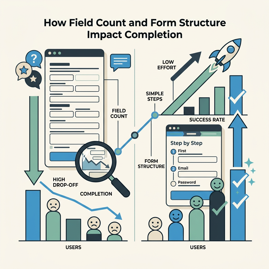
Field count is the most actionable variable in form optimization. The relationship between fields and completion is non-linear: the first few fields cost almost nothing, but once you cross 5–7 fields, each additional field becomes exponentially destructive. This is the "field count cliff" and it's where most form optimization starts.
The Field Count Cliff: Where Conversions Collapse
At 3 fields, forms convert at 23.1%. At 5 fields, they drop to 17.0%—a cost of 3 percentage points per added field. Then something changes. At 7 fields, completion plummets to 11.4%. At 10+ fields, it bottoms at 6.9%. The cliff between 5 and 7 fields exists because, from a cognitive perspective, 5-7 items represent the boundary of working memory. Beyond that threshold, the form shifts from "quick request" to "application," and abandonment accelerates. Every field beyond 7 costs roughly 2.8 percentage points, compared to 1.5 points below 5. If you're running a 10-field form and seeing 7% completion, your industry baseline is not the problem—your field count is. Removing 3 fields could realistically lift you to 13–15% completion.
Multi-Step Forms: The +14% Lift Strategy
The single most effective structural optimization is converting single-page forms to multi-step layouts. Forms split across 2–3 steps see a 14% average completion lift, with lead-gen forms specifically seeing 21% improvements. The mechanism is psychological: after completing the first low-friction step (name, email), a progress bar showing 33% completion raises the cost of abandonment. Users have already invested mental effort; quitting feels wasteful. Conditional logic (hiding fields until previous answers make them relevant) compounds the lift. A 10-field form becomes psychologically manageable if fields 1–3 appear on step 1, fields 4–7 appear only if the user selects a specific option on step 2, and fields 8–10 defer to a final step.
For developers building forms on static sites without backend infrastructure, multi-step forms traditionally required custom JavaScript state management or server-side session handling. FormBeam's form configuration handles the backend logic automatically, allowing you to define multi-step flows in the form definition without building state management yourself. The field deferral and conditional logic work server-side, eliminating the scaffolding work that typically deters indie developers from attempting multi-step forms.
"Multi-step forms recover the +14% completion lift not because they reduce field count, but because they reshape the user's perception of effort. Showing 33% completion after step one raises the psychological cost of abandonment—the user has already invested effort."
Mobile Optimization: The 32% Gap No One Talks About
Lead-gen forms on mobile convert at 32% below desktop rates—that is, 8.7% on mobile versus 12.8% on desktop for a normalized 5-field B2B form. This gap is larger than any industry benchmark variation and rarely gets the optimization attention it deserves. Ecommerce checkout has closed this gap to 8% as payment platforms (Apple Pay, Google Pay) standardized mobile entry. But traditional lead-gen forms (contact, demo request, signup) remain mobile disasters. Why? Mobile viewport constraints make multi-line forms feel endless. Numeric keyboards appear for email fields. Auto-capitalization and autocorrect break data entry. Soft keyboards obscure form progress. If 40% of your traffic is mobile, a 32% gap means you're leaving 8–12 percentage points of conversion on the table. Mobile form optimization—single-column layouts, progressive disclosure, simplified validation, mobile-optimized input types—is not cosmetic.
Common Reasons Forms Fail: The Abandonment Hierarchy
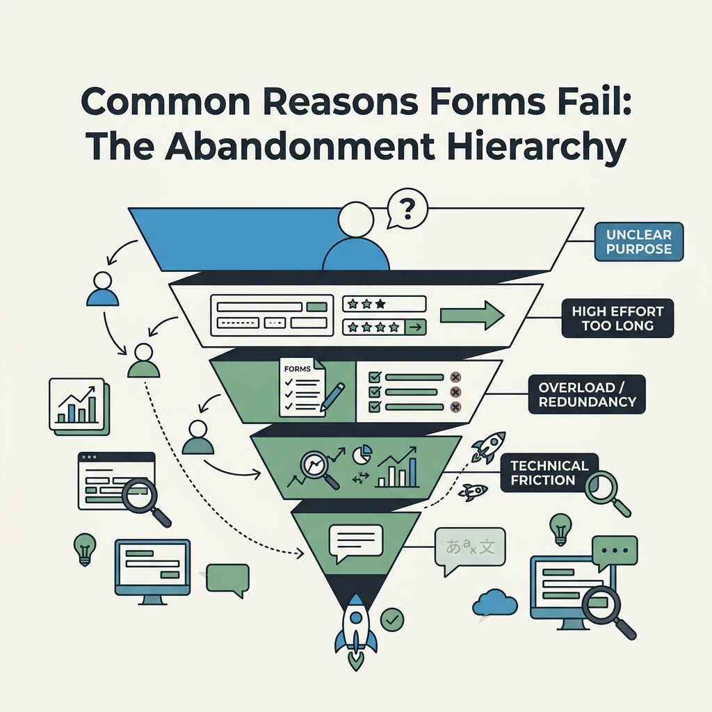
Understanding why users abandon forms is more actionable than chasing benchmark numbers. Self-reported abandonment reasons cluster into four categories: form length (37%), unclear or unexpected fields (22%), trust concerns about data use (19%), and validation errors at submit (14%). The remaining 8% is technical (timeouts, browser issues, distractions). Most form optimization addresses one of these four.
Form Length and Field Reduction
37% of abandons cite length as the reason. This maps directly to the field count cliff. Users see a form with 10 fields and make an instant abandonment decision before reading a single label. The solution is ruthless field auditing: which fields are required by law or core business logic? Which are nice-to-have? Which can be collected later (after initial conversion)? Most forms have 2–3 fields that survive this audit. The other 5–7 are historical cruft, "wouldn't it be nice to know" nice-to-haves, or fields that could be inferred post-submission. Reduction is your first lever. If you can't reduce, use multi-step logic to hide fields or defer them to later steps.
Unclear Field Labels and Unexpected Asks
22% of abandons cite confusion about what fields mean or why they're being asked. A field labeled "Organization" without context is ambiguous (company name? government agency? nonprofit? home?). A request for phone number before trust is built feels invasive. The solution is explicitness: relabel "Organization" as "Company name" or "Nonprofit name." Add microcopy under sensitive fields: "We'll only use this to contact you about your quote." If a field feels unexpected in context, it is unexpected—move it or remove it.
Trust Concerns About Data Use
19% of abandons cite data privacy and security concerns. Users fear their email will be spam-blasted or personal data will be sold. The solution is a visible privacy statement directly on the form or immediately above it: "Your data is private. We'll use your email only to send you the requested resource, then never again. No spam, no selling lists." A link to a real privacy policy builds confidence more than a generic "we protect your data" promise. Trust is the unleveraged growth lever in most forms—a single sentence prevents 19% of abandonment.
Validation Errors: The Submit-and-Retry Penalty
14% of abandons happen at submit due to validation errors: invalid email, misformatted phone, required fields left blank. Most forms show these errors all at once, forcing users to scroll, identify the mistakes, fix them, and resubmit. This is the "modal failure state" and it drives ~28% of multi-error abandons. Real-time validation (showing pass/fail state as users leave each field, rather than on submit) prevents this friction. Studies show inline validation lifts completion 5–13% depending on form length. For developers, implementing real-time validation traditionally requires JavaScript event listeners and instant API feedback. FormBeam's validation system provides real-time feedback without custom code—validation rules are defined in the form configuration and evaluated server-side before the user even submits, giving them instant corrections as they tab through fields.
Best Practices for Hitting or Exceeding Your Industry Benchmark
Armed with your industry benchmark, the next step is tactical optimization. These practices move the needle across form type, industry, and traffic source. B2B benchmarking research from Kliq Interactive reveals that the highest-converting companies share a disciplined approach to form optimization focused on these core tactics.
Start with Internal Benchmarking, Not External
The most valuable comparison isn't against published industry averages—it's against your own forms. Which of your forms convert best? What do they have in common? Lowest-performing? What's different? Track your own forms across time: is performance improving, stable, or declining? This internal lens is more actionable than external benchmarks because it reveals what resonates with your specific audience. A B2B SaaS company might find that demo requests with 4 fields convert at 18% (well above the 9.8% industry median) while newsletter signups with 2 fields convert at only 12%. This tells you your audience values specific, intentional asks (the demo) but has form fatigue around generic signups. Your optimization roadmap should reflect this reality, not chase the industry average.
Clarify Your Value Proposition in Form Context
Weak value propositions leak more conversion than poor form mechanics. "Download our guide" is generic. "Get the 2026 Form Completion Rate Benchmark Report with data from 10,000+ companies" is specific. Better: "See how companies like yours reduced form abandonment by 35%." The form itself should reinforce this promise with visible security badges, testimonial quotes, or usage counts ("Join 15,000+ developers..."). A user who understands why the form matters completes it 20–30% more often than one who sees it in isolation.
Minimize Visible Fields on First Load
If your form has 6+ required fields, every field visible on load reduces completion. Implement progressive disclosure: show 2–3 high-trust fields first (name, email), then reveal dependent fields based on answers. This tactic compounds the multi-step benefit—you get the psychology of progress plus the hidden-field benefit of reduced perceived complexity.
Optimize for Mobile-First Form Entry
Given the 32% mobile-desktop gap, mobile optimization is non-negotiable. Use mobile-specific input types (tel, email, number) that trigger appropriate keyboards. Avoid dropdown fields on mobile—they require extra taps. Single-column layouts. Large touch targets (44px minimum). Test on actual devices, not desktop browser mobile emulation. The gap suggests this is underinvested relative to its impact.
Implement Real-Time Inline Validation
Rather than showing all errors on submit, validate each field as the user leaves it (on blur). Show a green checkmark for valid entries, red underline for invalid. This prevents the submit-and-retry penalty. Tools that handle this automatically (FormBeam includes this in its submission handling) eliminate the JavaScript boilerplate that deters indie developers from implementing it manually.
Form Completion Rate Benchmarks in Practice: A Developer's Workflow
Understanding benchmarks is useless without a tracking system. For developers building on static sites, form completion measurement traditionally required custom event tracking or third-party analytics integrations. The modern approach is simpler: use a form backend that surfaces completion data in a dashboard. This gives you:
- Completion rate tracking: See real-time completion rate and how it trends over time.
- Field-level abandonment: Which field drives the most abandons? Fix that first.
- Submission validation trends: Are validation errors spiking? It might signal UX confusion, not user intent issues.
- Cohort comparison: Do mobile vs. desktop completions differ by 32% like the benchmark suggests? If not, your mobile UX might be better than average—celebrate it and document the pattern.
FormBeam's submission dashboard and analytics provides this visibility out of the box. You embed one line of JavaScript in your static site, and every submission is logged with timestamps, field-level completion data, and error patterns. This transforms benchmarking from abstract statistics into concrete, actionable metrics tied to your specific audience and form design.
The Developer's Optimization Loop
The workflow becomes iterative: measure baseline completion, identify the lowest-converting field (often the last field before abandonment), audit whether that field is required, and test removal or deferral. Measure again. If completion improved, keep the change. If it didn't, the bottleneck is elsewhere—possibly value proposition clarity, mobile rendering, or traffic quality. Without this feedback loop, you're guessing. Use FormBeam's email alerts and notifications to stay informed about submission patterns without manual dashboard checks.
Conclusion
Form completion rate benchmarks reveal that your industry sets a floor, but your form design determines whether you hit that floor or exceed it. The median 17.3% completion rate hides dramatic variation: ecommerce checkout forms convert 28.4%, while financial services manage 5.4%. Field count is your most actionable variable—the cliff between 5 and 7 fields is where conversions collapse. Multi-step forms lift completion by 14% on average, and mobile optimization addresses a 32% gap most teams ignore. The top abandonment drivers are form length (37%), unclear fields (22%), trust concerns (19%), and validation errors (14%)—each solvable through field reduction, clarity, privacy messaging, and real-time validation.
Rather than chasing industry averages, track your own forms and optimize incrementally. Implement the structural changes—multi-step design, field reduction, mobile optimization, inline validation—and re-measure. The teams shipping the highest completion rates aren't necessarily the largest or best-resourced; they're the ones with clear visibility into how forms perform and the discipline to optimize ruthlessly based on that data. Try FormBeam to get started with a form backend that surfaces this completion data in a real-time dashboard, eliminating the infrastructure work and leaving you focused on optimization.
FAQs
What is a good form completion rate?
A good form completion rate depends entirely on your industry. The cross-industry median is 17.3% for forms shown to qualified traffic. Ecommerce checkout forms typically exceed 25%, while lead-gen forms in regulated industries like financial services average 5–7%. Rather than targeting a generic benchmark, audit your own forms first: which of your existing forms convert best, and what do they have in common? Your highest-converting form reveals what resonates with your audience. If you're significantly below your industry median (say, 3% in SaaS, 9.8% median), field reduction or form structure changes are your levers. The most valuable comparison is historical—is your completion rate improving month-over-month—not external.
Why do forms have such high abandonment rates?
Forms abandon at high rates because they represent friction at the moment of highest intent. Self-reported abandonment reasons cluster into four buckets: form length (37%), unclear field labels or unexpected asks (22%), trust concerns about data use (19%), and validation errors (14%). Most forms are not built to minimize these frictions—they're built to collect as much data as possible. The benchmark data proves that ruthless field reduction, clear value propositions, visible privacy statements, and real-time validation each recover 5–13% of completion. The companies hitting 20%+ completion rates are typically those that have implemented all four changes, not just one.
How can I improve my form completion rate quickly?
The fastest wins come from field reduction, multi-step design, and mobile optimization. Start by auditing your form: which fields are truly required by law or core business logic? Remove everything else or defer it to a post-submission email. If you have 6+ visible fields, convert to a multi-step form showing 2–3 fields per step—studies show this lifts completion 14% on average. Then test mobile rendering: use mobile-specific input types, single-column layouts, and remove dropdown menus if possible. Finally, implement inline validation so users see errors as they type rather than on submit. These three changes—field reduction, multi-step structure, and real-time validation—typically recover 10–20 percentage points of completion. Measure before and after using a form analytics tool to quantify the impact and guide next iterations.