Web Forms Explained: Types, Uses, and Common Patterns
Web forms are the backbone of digital interaction—but most developers either overcomplicate them or leave critical functionality on the table. Expedia added $12 million in annual profit simply by removing one optional field, while 27% of users abandon forms when they're too long. Yet the stakes go beyond length: the right form design, structured around proven patterns and input types, determines whether you collect leads, process transactions, or lose conversions to friction. Here's how to build forms that work.
Key Takeaways
- 66% of users who start a form will complete it (Zuko.io, 2025), but every extra field increases abandonment risk by 5-10%.
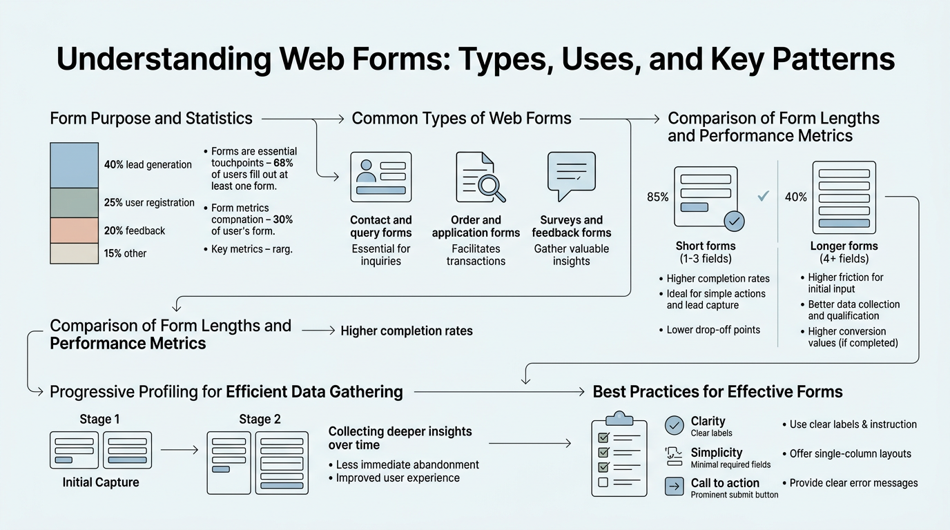
- Web forms come in five core types—contact, lead capture, transaction, survey, and login forms—each with distinct purposes and UX requirements.
- Multi-step and progressive forms reduce abandonment by breaking complex data collection into digestible steps.
- Contact Forms: Direct user-to-business communication, used for inquiries, feedback, and support requests with minimal required fields.
- Lead Capture Forms: Optimize for conversion by requesting name, email, and one key interest field to maximize submission rates and qualify prospects.
- Transaction Forms: Multi-step checkout and payment flows requiring extensive validation, security compliance, and error recovery.
- Survey Forms: Collect structured feedback using radio buttons, checkboxes, and text areas to understand customer sentiment and behavior.
- Login & Authentication Forms: Secure credential entry with password masking, optional two-factor authentication, and account recovery options.
- Multi-Step Forms: Break long forms into focused sections to reduce perceived complexity and improve completion rates by up to 30%.
What Are the Five Core Types of Web Forms?
Every form on the web serves one of five fundamental purposes. Understanding which type you're building determines what fields to include, how to structure the interface, and what backend infrastructure you need. Forms aren't generic—each type has specific UX patterns and conversion dynamics that separate high-performing implementations from abandonment traps.
Contact Forms: Direct Communication
Contact forms are the simplest and most universal form type. They exist solely to facilitate direct communication between a user and your business. A basic contact form asks for a name, email address, message, and optionally a subject line or category. The goal isn't to qualify leads or collect extensive data—it's to create a low-friction pathway to your inbox.
The best contact forms follow a single principle: minimize fields. Typically you need just three essentials: name, email, and message. Some add a subject or contact reason as a dropdown to pre-sort inquiries. Beyond that, you're adding friction without value. When you embed a contact form on your website using a service like FormBeam's backend form infrastructure, you can configure it to send notifications immediately while storing submissions in a searchable dashboard—no server needed.
"Minimizing form fields isn't just good design—it's fundamental to conversion. The fewer inputs a user must complete, the higher the completion rate. This principle applies across all form types, from contact forms to lead capture."
Lead Capture Forms: Conversion-Focused Collection
Lead capture forms are designed for conversion. Unlike contact forms, they exist to turn anonymous visitors into qualified prospects. Quicksprout increased leads by 26% by cutting form fields—the single most effective tactic for lead generation. Lead capture forms typically request name, email, and one additional data point: company, industry, budget range, or use case interest. Some add phone number, but only if your sales process demands immediate contact.
The psychology is straightforward. A three-field form will convert 2-3x higher than a six-field form on the same audience. The first field you add beyond name and email drives measurable abandonment. Progressive disclosure—asking for additional details only after the user has committed—helps: collect email first, then ask deeper qualification questions only to those who upgrade or request a demo. According to conversion rate optimization research from 2025, this approach consistently outperforms long-form initial captures.
"Progressive disclosure transforms form UX by removing perceived friction upfront. By revealing additional fields only to engaged users, you maximize initial conversions while still capturing deep qualification data from hot prospects. This two-stage approach beats long forms every time."
Transaction Forms: Checkout and Payment
Transaction forms are complex multi-step workflows that collect payment information, shipping details, and billing addresses. They're the highest-stakes form type because abandonment directly costs revenue. Rocket Mortgage increased conversions by 26% by simplifying their online application process into logical steps, breaking a 20-minute form into digestible sections.
Transaction forms demand:
- Progressive steps: Separate billing address, shipping address, and payment into distinct pages to reduce perceived complexity.
- Real-time validation: Flag invalid zip codes, email formats, and card numbers instantly rather than at submission.
- Error recovery: Save partial progress so users don't lose data if they close the browser or refresh the page.
- Security indicators: Display SSL badges and fraud protection messaging to build confidence in payment entry.
- Guest checkout option: Don't force account creation—let users transact without registration if you want to maximize conversion.
Survey Forms: Feedback Collection
Survey forms gather structured feedback, product insights, and customer satisfaction data. Unlike lead capture forms optimized for conversion, surveys are designed for data quality. They use radio buttons, checkboxes, rating scales, and text areas to capture nuanced responses. Net Promoter Score (NPS) surveys, satisfaction surveys, and feature request forms all follow this pattern.
Survey forms prioritize clarity over brevity. A well-written survey might have 10-15 questions but still maintain high completion because users understand the value of their input. The key is visual hierarchy: group related questions together, use consistent labeling, and show progress (e.g., "Question 3 of 8") so respondents know how much effort remains.
Login and Authentication Forms: Secure Access
Login forms are security-critical. They require password masking, account recovery options, and often two-factor authentication (2FA). The simplest version asks for email and password. More sophisticated implementations add passwordless login via magic links or social login (Google, GitHub). The pattern is universal but the stakes are high: poor UX in login forms drives user frustration and account lockouts.
Modern login forms include:
- Clear password visibility toggle (eye icon)
- "Forgot password?" link prominently placed below the password field
- Optional "Remember me" checkbox for returning users
- 2FA prompt on second factor authentication flows
- Clear error messaging (never confirm whether an email is registered—for security, say "Invalid email or password")
How Do Form Input Types Shape User Experience?
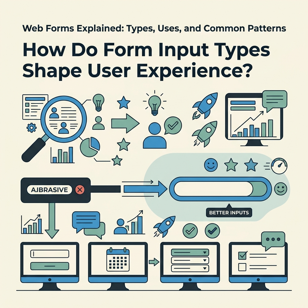
HTML5 introduced specialized input types that go far beyond the generic text field. Each input type optimizes for a specific data category and triggers context-aware behaviors on mobile devices. Using the right input type isn't cosmetic—it directly impacts completion rates by reducing typing effort and format confusion.
Specialized Input Types and Mobile Optimization
The email, number, and tel input types aren't just semantic—they unlock device-specific keyboards on phones and tablets. An email input triggers a keyboard layout with the @ symbol prominent. A tel input shows the numeric pad. A number input shows a dial pad. This small detail cuts typing effort by 30% on mobile, where friction is highest. According to IvyForms' HTML form best practices guide, specialized input types remain one of the highest-impact, lowest-cost UX improvements available to developers.
The full set of HTML5 input types includes:
| Input Type | Best For | Mobile Behavior | Built-in Validation |
|---|---|---|---|
| Email addresses | Shows @ symbol, autocomplete | Format validation automatic | |
| password | Secure credential entry | Masks text by default | None |
| tel | Phone numbers | Shows dial pad | Format depends on region |
| number | Numeric values | Shows numeric pad with +/− | min/max constraints |
| url | Web addresses | Shows / and . prominently | Format validation automatic |
| date | Date selection | Shows native date picker | Validates date format |
| time | Time entry | Shows native time picker | Validates time format |
| range | Slider input for values | Touch-friendly slider | min/max enforcement |
| color | Color picker | Shows color selector | None |
| file | File uploads | Triggers file picker | accept attribute filters |
Date and time inputs eliminate format confusion entirely—no more "mm/dd/yyyy vs. dd/mm/yyyy" debates. The native picker works across browsers and devices, reducing invalid entries. Similarly, email and url inputs provide free, browser-native validation that doesn't require custom JavaScript.
Validation Attributes and Real-Time Feedback
HTML5 forms support native validation through attributes: required, pattern, min, max, and step. These let you validate input without writing a single line of JavaScript. An email input with the required attribute prevents submission of empty or malformed entries. A number input with min="0" and max="100" restricts the numeric range.
The best forms combine native validation with real-time error feedback. Real-time validation significantly improves completion rates because users see errors as they type rather than after clicking submit, giving them immediate opportunity to correct mistakes. This is especially critical on forms like checkout where psychology and confidence matter. When you're managing forms on a static site with FormBeam's form creation tools, validation rules are configured once and applied consistently across all submissions.
Labels, Placeholders, and Accessibility
Every input must have an associated label using the for/id attribute pattern. Placeholders are helpful visual hints but shouldn't replace labels—screen readers and keyboard users depend on explicit labels. A form with visual polish but no labels is inaccessible to 15% of users and fails modern web accessibility standards.
The pattern is simple: each input gets a visible label above it, and the label's for attribute matches the input's id. This improves click targets (users can click the label to focus the field), helps screen readers announce field purpose, and keeps forms compliant with WCAG accessibility standards.
What Are Common Form Patterns and When Should You Use Them?
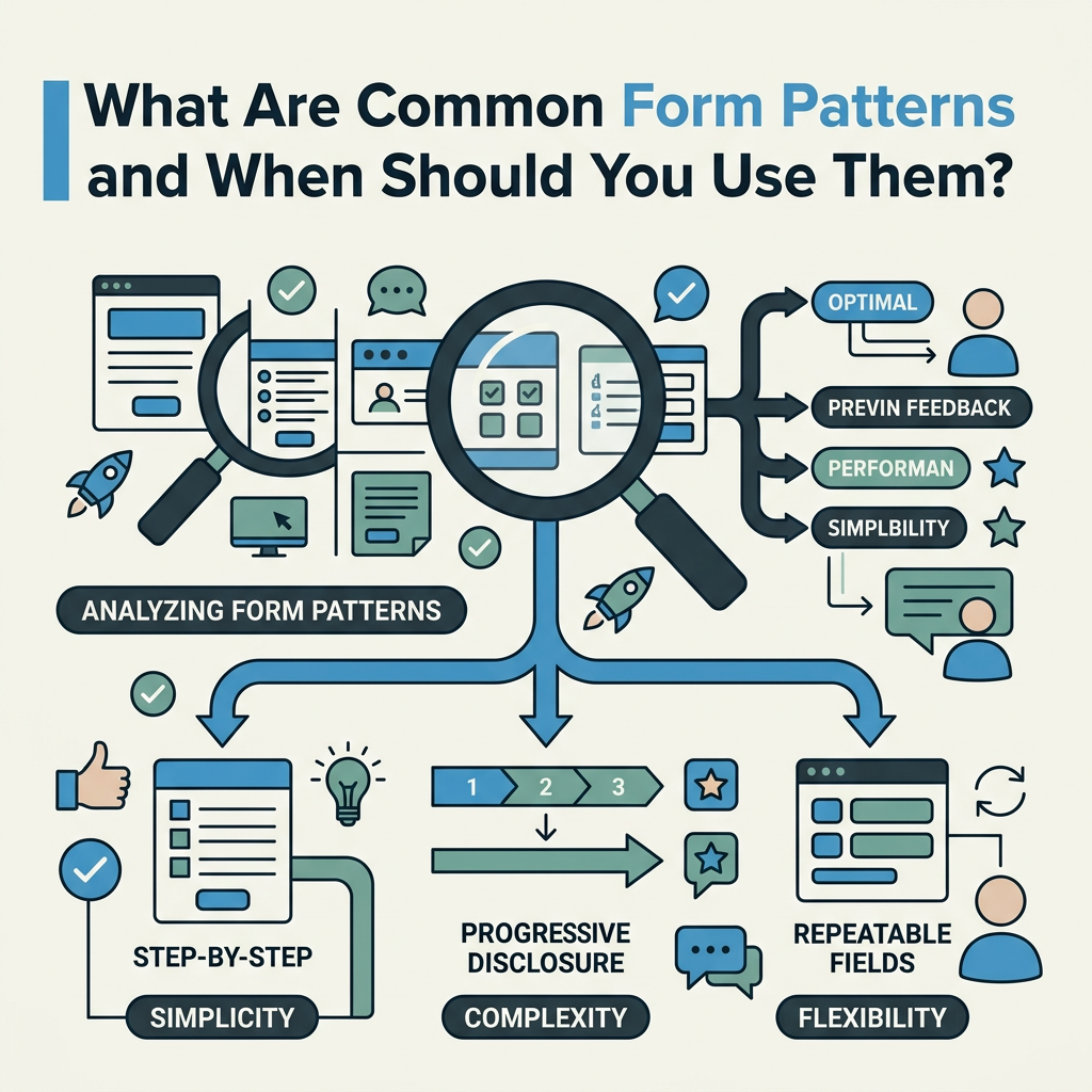
Beyond the five basic form types, designers and developers have evolved patterns that address specific conversion or usability challenges. Multi-step forms, conditional logic, and progressive disclosure are strategies that appear across industries from fintech to SaaS.
Multi-Step Forms: Breaking Complexity Into Steps
A multi-step form distributes fields across multiple pages or sections, showing one focused group at a time. Unbounce improved conversions by 30% by reducing a form from four fields to three on a single page, but multi-step forms go further: they break long forms into 3-5 focused steps with a breadcrumb or progress indicator.
The psychological principle is simple: a 12-field form feels overwhelming; a 3-field form per step feels manageable. Users are more likely to start and complete a form when the perceived burden is smaller. The tradeoff is that multi-step forms require persistence—saving progress between steps so users don't lose data if they navigate away.
Multi-step forms work best for:
- Checkout and payment flows (billing info, shipping, payment in separate steps)
- Complex applications (personal details, employment, financial info in stages)
- Onboarding flows (company info, team setup, integration config as distinct phases)
- Long surveys (group related questions together to reduce fatigue)
"Multi-step forms succeed because they reduce the perceived effort required to complete data entry. Breaking a long form into digestible chunks has the same effect as a progress bar—users see the finish line and are more likely to reach it. Save progress at every step to ensure abandonment doesn't mean lost data."
Conditional Fields and Progressive Disclosure
Conditional logic hides or reveals fields based on previous answers. An e-commerce form might ask "Do you want to ship to a different address?" and only reveal the shipping address fields if the user selects "Yes." This reduces clutter while collecting all necessary data.
Progressive disclosure asks for essential information first, then additional details only to users who engage further. A lead capture form might ask name and email, then reveal company and budget fields only after the user clicks "Learn More" or schedules a demo. This strategy maximizes the initial conversion (because fewer fields = higher completion) while still gathering detailed qualification data from prospects who express intent.
Single-Column vs. Multi-Column Layouts
Form layout affects completion rates directly. Single-column layouts are completed faster with less confusion than multi-column layouts because the visual flow is unambiguous: top to bottom, left to right, one field per row. Multi-column layouts force the eye to jump, creating cognitive load.
The only exception is the name field (first name / last name side by side) and address fields (street, city/state, zip across two or three columns for familiar data). For everything else—email, message, phone, etc.—single-column wins. Mobile defaults to single-column anyway, so designing for mobile-first enforces this discipline.
Social Proof and Trust Signals Near Forms
HubSpot saw a 24% conversion lift by adding testimonials near forms, and this pattern repeats across industries. A quote from a customer, a trust badge (SSL certificate indicator), a logo collection of known clients, or a satisfaction metric ("Join 10,000+ users") placed immediately above or beside a form builds confidence before submission.
The neuroscience is clear: forms ask users to commit (email address, phone, payment). Trust signals reduce perceived risk. A few proven tactics:
- Place one customer testimonial above the form
- Show security badges ("SSL Secure", "GDPR Compliant")
- Display satisfaction metrics ("99.9% uptime", "1000+ happy customers")
- Add a live chat widget nearby for immediate questions
How Should You Handle Form Submission, Storage, and Notifications?
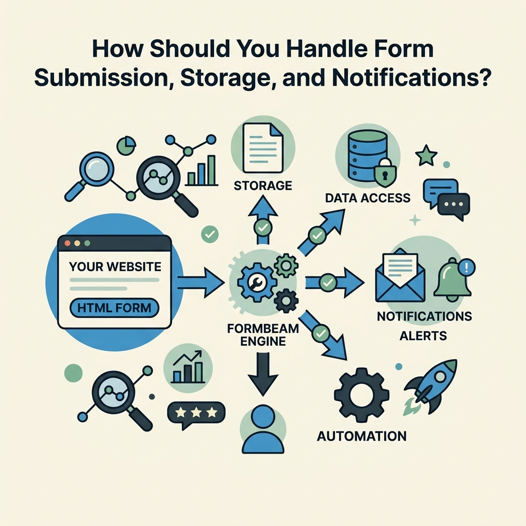
Building the form is half the work. The other half—capturing submissions, storing data, validating, and notifying the right people—requires backend infrastructure. For indie developers and small teams building static sites, this infrastructure challenge is why many reach for tools instead of building custom backends.
Submission Handling and Email Notifications
When a user submits a form, three things must happen: (1) the submission is stored in a database, (2) validation occurs to reject spam or malformed data, (3) notifications are sent to the relevant person. A contact form submission might email the sales team immediately. A survey response might be stored for batch analysis. A checkout form must validate payment and trigger fulfillment workflows.
For static sites (HTML, React, Next.js, Vue, Svelte), sending form submissions directly to your own backend is complex—you need API endpoints, error handling, and database management. Tools like FormBeam eliminate this infrastructure entirely by providing a backend form service. You embed a form in your HTML with one line of code, and FormBeam handles storage, validation, spam filtering, and email notifications automatically. No backend code required.
Spam Filtering and Security
Any form exposed to the internet will attract spam. Bots will submit garbage data and abuse your email notifications. Effective spam filtering uses multiple signals: reCAPTCHA or hCaptcha integration, rate limiting (max submissions per IP per minute), honeypot fields (invisible fields that real users won't fill but bots will), and keyword filtering. When you need robust protection, FormBeam's spam protection documentation covers all these strategies.
Security extends beyond spam. Forms collecting sensitive data (credit cards, social security numbers, passwords) must use HTTPS, validate input server-side (never trust client validation alone), and comply with data protection regulations (GDPR, CCPA). A form handling payments must meet Payment Card Industry (PCI) compliance standards.
Searchable Dashboards and Data Organization
Once submissions are collected, they need to be organized and searchable. A searchable dashboard lets you quickly find submissions by name, email, date, or content without exporting to CSV and opening spreadsheets. This matters operationally: when a customer says "I submitted a form on Tuesday," you need to find it in seconds.
A well-designed form dashboard includes:
- Full-text search across all submission fields
- Filters by date, status (new, read, archived), or custom tags
- Export functionality (CSV, JSON) for bulk data analysis
- Integration with email and CRM tools to sync submissions to your workflow
- Auto-reply options to acknowledge receipt and set expectations
Conclusion
Web forms are deceptively simple on the surface but strategically powerful when built correctly. The five core types—contact, lead capture, transaction, survey, and login—each serve distinct purposes, and understanding which type you're building directly impacts your design decisions. The right input types, field count, and layout patterns can increase conversion rates by 15-30%. 66% of users who start a form will complete it—your job is to remove friction so those users reach the finish line.
The backend matters equally. Submission storage, spam filtering, email workflows, and searchable dashboards aren't nice-to-haves—they're essential infrastructure. For teams building on static platforms without backend servers, FormBeam provides that entire backend in one line of embedded code, handling validation, notifications, and data organization instantly. Start with FormBeam's free tier (100 submissions per month) and upgrade as you scale.
FAQs
What are the main types of web forms and their purposes?
The five core types are: Contact forms for direct communication (name, email, message), lead capture forms for conversion (optimized for minimal fields to maximize completion), transaction forms for checkout and payments (multi-step with validation), survey forms for feedback collection (using radio buttons and scales), and login forms for secure access (with password masking and account recovery). Each type has distinct UX requirements. Contact and lead capture forms prioritize speed and completion, while transaction forms require extensive validation and security. Survey forms optimize for data quality over brevity, and login forms must balance security with usability.
Why do fewer form fields increase conversion rates?
Every additional field increases abandonment by 5-10% on average because users perceive longer forms as more effort-intensive. Expedia's $12 million profit increase by removing one optional field demonstrates this principle at scale. The best lead capture forms ask for only three essentials: name, email, and one additional data point (company, use case, budget). The psychological driver is clear: a 3-field form converts 2-3x higher than a 6-field form. If you need deeper data, use progressive disclosure—collect basic info first, ask qualifying questions only to users who engage further (scheduling demos, upgrading plans, etc.).
How do I prevent spam and validate form submissions?
Effective spam filtering requires multiple layers: reCAPTCHA or hCaptcha, rate limiting, honeypot fields, and keyword filtering. Server-side validation is critical—never rely on client-side validation alone because bots bypass it. Honeypot fields (invisible inputs that real users won't fill but bots will) catch many automated attacks. For static sites without backend infrastructure, using a service that handles spam filtering, validation, and secure storage eliminates the complexity. Real-time validation also improves the user experience by flagging errors immediately as users type rather than after submission, reducing abandonment from format confusion.