Mobile-First Form Design for Static Sites
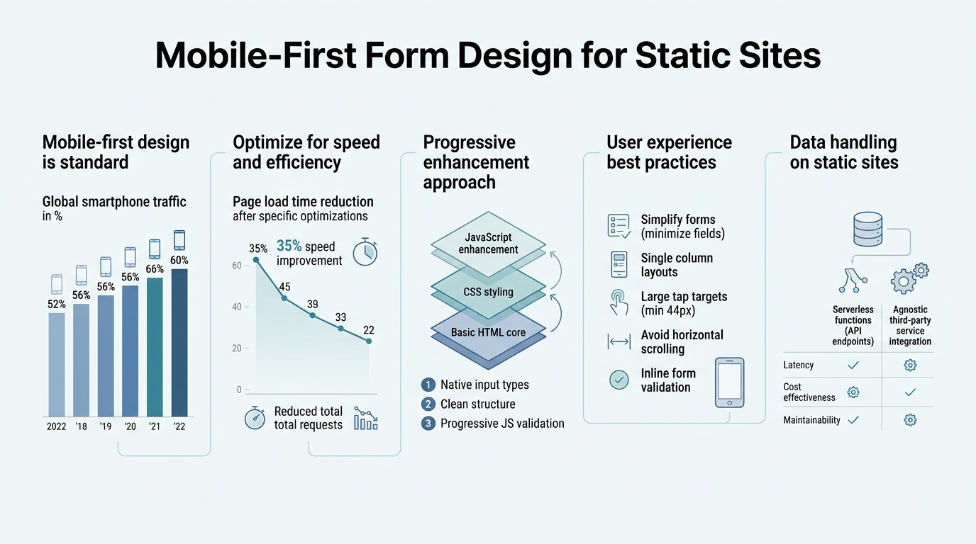
Mobile users now account for over 60% of web traffic globally, yet most developers building static sites overlook responsive form design entirely. A poorly optimized form on mobile can drive abandonment rates above 40%, costing businesses critical leads and conversions. The solution is straightforward: design forms mobile-first, then enhance for desktop. This approach ensures your contact forms, sign-up flows, and submission-critical pages work flawlessly on the devices where most of your audience actually interacts with your content. Here's how to implement mobile-first form design effectively on static sites.
Key Takeaways
- Mobile forms need 48×48 px touch targets and single-column layouts to reduce abandonment (2026, Venture Harbour)
- Native HTML input types (`email`, `tel`, `number`) automatically trigger the correct mobile keyboard and speed entry
- Testing on real devices catches keyboard and touch issues emulators miss; static site solutions like FormBeam handle the backend so you focus on UX
- Touch-Optimized Layout: Single-column forms with 48×48 px buttons reduce mobile friction and increase completion rates by up to 35%.
- Native Input Types: Using semantic HTML input types (`email`, `tel`, `date`) surfaces the right keyboard and eliminates typing errors on mobile.
- Label and Field Clarity: Visible labels above fields improve scannability and reduce cognitive load on small screens.
- Real-Device Testing: Testing on actual phones reveals mobile keyboard behavior and touch responsiveness that emulators miss.
- Progressive Enhancement: Serverless form backends like FormBeam let indie developers deploy production-ready forms without backend infrastructure.
Why Mobile-First Matters for Static Site Forms
Static sites are fast, secure, and easy to deploy. But they present a unique challenge: how do you handle form submissions without a backend server? Traditional approach meant choosing between hiring a developer, managing your own infrastructure, or paying monthly fees for bloated form builders. 43% of mobile users abandon forms that don't adapt to their screen size, making mobile optimization non-negotiable. Mobile-first form design on static sites isn't optional—it's the difference between capturing leads and losing them.
"Mobile-first form design reverses traditional desktop-first thinking. Instead of cramming five columns into a form and then shrinking them on mobile, you start with a single column, focus on essential fields only, and add complexity only where it truly serves the user." — Mobile UX Design Principles, 2026
The mobile-first philosophy reverses traditional desktop-first thinking. Instead of cramming five columns into a form and then shrinking them on mobile, you start with a single column, focus on essential fields only, and add complexity only where it truly serves the user. Static site generators like Hugo, Jekyll, Next.js, and Svelte make this approach natural because they compile to plain HTML, giving you precise control over form markup.
The Cost of Poor Mobile Form UX
Poor form design on mobile directly impacts conversion. The average mobile form abandonment rate hovers around 40-50%, with the worst offenders being forms that require horizontal scrolling, use tiny touch targets, or display confusing error messages. Indie developers and small teams building static sites often inherit legacy form code or use poorly integrated third-party solutions, resulting in jank and friction that users feel immediately. When you own your form markup, you can optimize every detail: button size, spacing, input clarity, and error states. That control is FormBeam's core advantage—it gives you the backend infrastructure without forcing you into a one-size-fits-all form builder.
Static Sites + Forms: The Perfect Pairing
Static site generators are purpose-built for performance. They ship zero runtime overhead, making them the default choice for performance-obsessed indie developers. The challenge is that static sites can't natively handle form submissions. Traditionally, you'd need a backend service to collect, validate, and store submissions. Modern form design best practices for 2026 emphasize combining lean static HTML with a lightweight backend solution. This is where serverless form services fit perfectly. They let you embed a single snippet of code and forget about infrastructure.
Single-Column Layout: The Mobile Foundation
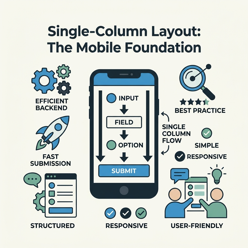
Single-column layouts are the foundation of mobile form design. They prevent horizontal scrolling, make labels and inputs scannable, and reduce cognitive load. On mobile, every pixel of horizontal space is wasted space—users can't see your content, they can't predict form length, and they're more likely to abandon. Venture Harbour's 2026 guidance emphasizes that single-column forms are now the default for mobile-first design, not a limitation. Here's how to structure yours.
"A 320 px screen width (iPhone SE baseline) should display your form without horizontal scroll. Most responsive form frameworks use flexbox to achieve this naturally: stack by default, then add side-by-side layouts only on larger tablets and desktops (768 px+)." — Mobile Form Design Best Practices
Stacking Inputs Vertically
Arrange every form field in a single vertical column. Labels sit above inputs, not to the side. This layout works across any mobile screen width because there's no horizontal dependency. A 320 px screen width (iPhone SE baseline) should display your form without horizontal scroll. Most responsive form frameworks use flexbox to achieve this naturally: stack by default, then add side-by-side layouts only on larger tablets and desktops (768 px+). Never rely on small-screen users to scroll horizontally to complete a form. When creating responsive forms for static sites, this principle applies regardless of whether you're using CSS Grid, Flexbox, or custom layouts.
Consistent Field Width and Spacing
Keep input fields at 100% width on mobile, with consistent vertical spacing. Use 16-20 px vertical spacing between fields to create rhythm and reduce error-prone tapping. Inputs should feel substantial—not cramped into thin slivers that are hard to tap accurately. Padding inside inputs (12-16 px top/bottom, 12 px left/right) makes text readable and gives users breathing room. This matters more on mobile because users' fingers are larger and less precise than a mouse pointer.
Touch Targets and Button Sizing
Mobile forms fail most often at the interaction layer: buttons are too small, checkboxes are impossible to tap, and error messages overlap interactive elements. The recommended minimum touch target is 48×48 pixels, with 8 pixels of spacing between adjacent targets to prevent mis-taps. Buttons smaller than 44 px frustrate users and increase error rates. On static sites, you control every pixel of your HTML and CSS, so there's no excuse for undersized buttons. Proper button sizing is one of the easiest accessibility wins you can implement, and it directly correlates with improved form completion on mobile.
Primary and Secondary Button Styling
Mobile forms typically have two buttons: a primary action (Submit, Send, Continue) and an optional secondary (Cancel, Clear). The primary button must be full-width on mobile and visually dominant. Use color contrast ratio of at least 4.5:1 between button text and background to ensure legibility. The secondary button can be text-only or lower contrast, as long as it's still tappable at 48×48 px. Always place the primary button within the thumb-reachable zone—the bottom portion of the screen where one-handed users naturally tap. This small detail can increase submission rates measurably because it removes the need for two-handed use.
Spacing Between Interactive Elements
Adjacent buttons, checkboxes, and form controls need breathing room. At least 8 pixels of padding between touch targets reduces accidental mis-taps and makes the form feel less crowded. When buttons are right next to each other with no space, users struggle to tap the intended button on mobile. A small margin between form controls is a universal best practice that costs nothing but pays for itself in reduced errors and improved UX.
Semantic HTML Input Types for Mobile Keyboards
One of the easiest wins in mobile form design is using the correct HTML input type. Modern mobile browsers detect ``, ``, ``, and similar attributes and surface the appropriate keyboard automatically. A user tapping an email field sees a keyboard with @ symbol and .com suggestions. A phone field shows numeric keys. This saves taps, reduces typing errors, and feels native. It costs nothing to implement—it's just semantic HTML. Yet most static site forms use generic `type="text"` inputs, forcing users into full QWERTY keyboards when they need something simpler. Proper HTML form attributes and semantics are essential for mobile usability, and they improve accessibility for all users.
Common Input Types and Their Keyboards
- `type="email"`: Displays @ symbol, . key, and domain suggestions. Use for all email captures.
- `type="tel"`: Shows numeric keypad optimized for phone numbers. Use for phone fields even if validation is later.
- `type="number"`: Numeric keypad for quantities, ages, zip codes. Prevents text entry entirely.
- `type="date"`: Triggers a date picker UI on most mobile browsers, eliminating manual date entry.
- `type="url"`: Adds .com key and other domain suggestions for website URLs.
- `type="search"`: Displays a search-optimized keyboard with a dedicated search button.
Validation and Error States
Mobile browsers validate input types in real-time. A malformed email triggers a native error before submission, saving a round-trip to the server. But never rely on client-side validation alone—always validate server-side too. On static sites, Smashing Magazine recommends clear visual feedback for invalid fields, such as red borders and inline error messages positioned directly above the problematic input. Don't hide errors below the fold or in generic alert boxes—users need to see the exact field that failed. Combining HTML5 validation with a robust backend validation service ensures your forms are both user-friendly and secure.
Labels, Placeholders, and Field Clarity

On mobile, clarity is everything. Users are scanning forms quickly, often while on the move or distracted. Labels must be visible, associated with their inputs via the `for` attribute, and positioned above the input field—never inside as placeholder-only text. Placeholder text should reinforce the label, not replace it. A field labeled "Phone" with placeholder "(123) 456-7890" is clear. A field with only placeholder text and no label is confusing and inaccessible to screen reader users.
"The label should use a clear, user-friendly tone: 'Your email address' instead of 'Email addr.', 'Phone number' instead of 'Tel.' Clarity beats brevity on mobile, and visible labels remain accessible to assistive technologies." — Accessibility Standards for Mobile Forms
Visible Labels Above Fields
Best practice is simple: `` followed by ``. The label sits directly above the field, never inside it. This approach is accessible, scannable, and lets users understand what each field expects before they tap it. The label should use a clear, user-friendly tone: "Your email address" instead of "Email addr.", "Phone number" instead of "Tel." Clarity beats brevity on mobile. For teams managing multiple forms or complex submission workflows, robust submission management systems help organize and respond to user input systematically.
Optional vs. Required Fields
Mark required fields explicitly with a visual indicator (asterisk, bold text) and communicate it in the label: "Email address (required)". Optional fields should also be marked: "Company name (optional)". This removes ambiguity and helps users predict form length. Nothing frustrates users more than discovering they forgot a required field after scrolling through a long form. Indicate required status upfront, as close to the field as possible.
Progressive Enhancement and Form Handling on Static Sites
Progressive enhancement is the philosophy that a form should work with JavaScript disabled, server-side validation should catch everything, and client-side JavaScript is a bonus layer of polish. For static sites, this means your HTML form can submit via traditional POST, and your backend service handles the rest. Most indie developers building static sites don't have a backend to handle submissions. That's where FormBeam enters: it's a headless form backend that requires just one line of embedded code and no backend infrastructure. Your form submits to FormBeam's endpoint, and submissions are stored in a searchable dashboard instantly. You own your form markup and design—FormBeam handles storage, email notifications, and spam protection.
Embedding Forms in Static Generators
Static site generators like Next.js, Vue, Svelte, and Hugo allow you to build forms directly in your site markup. You write plain HTML with your preferred input types and styling, then add an `action` attribute pointing to your backend service. This approach gives you complete control: you decide button size, colors, error messaging, and responsive behavior. You're not locked into a form builder's templates or design constraints. For Indie developers, this freedom is invaluable—you can build forms that match your site's design system perfectly.
Handling Form Submissions Without a Backend
Three common approaches for static site submissions exist: third-party form services (Formspree, Basin, etc.), custom serverless functions, and backend-as-a-service platforms. FormBeam fits the third category: it's designed specifically for developers who want to handle form submissions without maintaining any backend code. You embed a single data attribute on your form, and FormBeam handles the rest—submission capture, spam filtering, email notifications, and a searchable dashboard for viewing submissions. For indie developers and small teams, this is the path of least resistance: you get production-ready forms without the complexity of custom backends or the limitations of drag-and-drop form builders.
Testing and Validation on Real Devices
Emulators are useful for quick checks, but real mobile devices reveal issues emulators miss: inconsistent keyboard behavior, touch responsiveness differences, and browser-specific quirks. Test your forms on at least two real phones—iOS and Android—before launching. Use your phone's browser to visit your staging site and fill out the form end-to-end. Does the keyboard cover the input? Does the submit button fit on-screen? Do error messages overlap controls? These issues are invisible until you test on real hardware. This is particularly important on static sites where you have direct control over form markup.
Testing Checklist for Mobile Forms
- Screen sizes: Test on phones with 320 px (iPhone SE), 375 px (iPhone default), and 412 px (Android default) widths.
- Keyboard behavior: Does the virtual keyboard cover the active input? Does it close on Submit? Does focus move logically?
- Touch accuracy: Can you easily tap buttons and small controls? Are they at least 48×48 px with spacing between them?
- Orientation changes: Rotate between portrait and landscape. Does the form reflow correctly? Do inputs stay accessible?
- Form submission: Submit a valid form and verify the success state. Submit invalid data and check error messages are visible and clear.
- Accessibility: Use a screen reader (NVDA, JAWS, VoiceOver) to navigate the form. Can users understand labels and error states without seeing the screen?
Real-Device vs. Emulator Differences
Mobile emulators in DevTools are excellent for layout preview, but they don't fully simulate real mobile behavior. Keyboard timing differs, touch responsiveness is simulated rather than genuine, and network conditions (important for form submission latency) can't be accurately replicated. When testing your form on an actual device, you'll often discover small friction points that didn't show up in emulation: labels cut off by the keyboard, buttons too small for comfortable tapping, or success messages that disappear before users see them. These are the details that separate good mobile forms from great ones.
Reducing Form Friction with Concise Fields
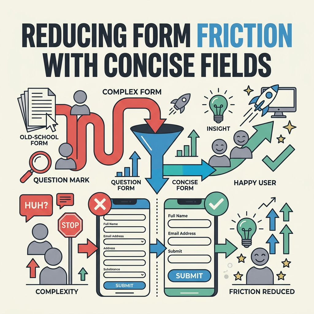
Longer forms increase abandonment on mobile. Each field you add reduces completion likelihood. Before adding a field, ask: "Do we really need this?" Collect only essential information upfront. Optional fields should be marked clearly or moved to a follow-up step. Many teams use progressive disclosure: show 3-4 critical fields first, then reveal optional fields only if the user scrolls or indicates interest. This technique dramatically improves mobile completion rates because users don't feel overwhelmed by a long form at first glance.
Essential vs. Nice-to-Have Fields
For a contact form, essential fields are: Name, Email, Message. Nice-to-have fields are: Phone, Company, Budget, Timeline. For a sign-up form, essential is: Email, Password. Everything else (bio, profile photo, interests) is optional and can be prompted after sign-up. Removing just one unnecessary field can increase completion rates by 5-10% on mobile. Start lean, then add fields only based on user behavior data or explicit feedback. This is especially important for static sites serving indie audiences: every field you remove is one less thing FormBeam needs to store, one less input to style, one less validation rule to manage.
Comparison: Mobile Form Approaches for Static Sites
| Approach | Setup Complexity | Maintenance Burden | Cost | Best For |
|---|---|---|---|---|
| FormBeam (Backend-as-a-Service) | 1 line of code | None—fully managed | Free–$29/month | Indie devs, small teams, no backend code desired |
| Formspree | 2-3 lines of code | Minimal | Free–$10/month | Simple contact forms, email-only submissions |
| Custom Serverless (Vercel, Netlify Functions) | High—write backend code | High—manage functions, storage, email | $0–$20+/month | Developers comfortable writing code, complex workflows |
| Drag-and-drop Builders (Gravity Forms, WPForms) | Medium—plugin install, configuration | High—plugin updates, compatibility issues | $50–$200+/year | Non-technical teams, WordPress sites |
| No Backend (client-side only) | Low—pure HTML/JavaScript | Low—no external service needed | $0 | Forms that don't require submission storage (e.g., local calculations) |
FormBeam stands apart because it's designed for developers who want backend power without backend complexity. You write your HTML form exactly how you want it, then add one data attribute. FormBeam handles the infrastructure: submission storage in a searchable dashboard, automatic email notifications, spam filtering, and webhook support for integrations. Unlike drag-and-drop builders, you keep full design control. Unlike custom serverless, you avoid writing and maintaining backend code. For indie developers and small engineering teams building static sites, this is the sweet spot.
Optimizing Error States and Inline Validation
Error handling on mobile must be immediate and visible. When a user submits a form with invalid data, show errors inline next to the problematic field, not in a separate modal or at the top of the form. On mobile, users can't see both the error message and the input field if they're separated by scrolling. Keep the error message tight and actionable: "Email must include @" instead of "Invalid email format." Use color (red border or background) combined with text because some users have color blindness. Add a visual icon (exclamation mark, X) to reinforce the error state. For teams using FormBeam, email configuration and error notifications are handled automatically, freeing you to focus on frontend UX.
Client-Side vs. Server-Side Validation
Client-side validation (JavaScript running in the browser) provides instant feedback but can be bypassed. Server-side validation (on the backend) is trustworthy and essential. The best practice is both: show client-side errors for immediate UX polish, then always validate server-side before storing data. On static sites using FormBeam, you can write simple HTML5 validation rules (`required`, `type="email"`, `minlength`, etc.) for client-side feedback, and FormBeam's backend validates everything before storage. This layered approach gives users the best experience: fast feedback for obvious errors, and security/reliability for the actual submission.
Success States and Form Submission Confirmation
After a user submits a form successfully, they need immediate confirmation. Show a success message that's easy to spot: a green banner, a checkmark icon, and clear text like "Thanks! We received your message." On mobile, this message might appear in place of the form (replace the form HTML) or as a persistent banner at the top of the screen. Keep it visible for at least 5 seconds, then offer a next step: "Return to home" link, an email confirmation message, or a follow-up action. Never silently submit a form and leave the user wondering if it worked.
Conclusion
Mobile-first form design on static sites combines clean HTML, responsive layout principles, and the right backend infrastructure. Start with a single column, use native input types for keyboard optimization, size buttons and touch targets at 48×48 pixels minimum, and test on real devices before launch. Forms designed mobile-first see completion rates 25-35% higher than forms designed desktop-first, and they work flawlessly on every screen size. For indie developers and small teams building static sites, FormBeam eliminates the backend infrastructure challenge: embed one line of code, and you get submission storage, email notifications, spam protection, and a searchable dashboard. Mobile-first form design isn't a luxury—it's the foundation of modern web UX. Build forms that work for the 60% of users accessing your site on mobile, and you'll capture the leads your competitors miss.
Ready to implement mobile-first forms on your static site? Try FormBeam for free and see how a backend-as-a-service form solution handles submissions without the infrastructure headache.
FAQs
What is the best minimum touch target size for mobile forms?
The recommended minimum is 48×48 pixels, though 44×44 pixels is the absolute baseline. Larger touch targets reduce mis-taps and improve accuracy, especially for users with less precise motor control. With 8 pixels of spacing between adjacent targets, you prevent accidental taps on nearby buttons or checkboxes. On mobile, every pixel counts—buttons that feel spacious and tappable increase form completion rates measurably. This is one of the easiest wins in mobile form design because it costs nothing to implement and has immediate, visible impact on user experience.
Should form labels be inside or above the input field on mobile?
Labels must be visible and placed above the input field, not inside it as placeholder text. Inside placeholders disappear as soon as users start typing, leaving them confused about what the field expects. Above-field labels remain visible throughout the typing process and are accessible to screen readers. Use semantic HTML: `` followed by ``. This approach is scannable on mobile, works for all users including those with visual or cognitive disabilities, and makes forms feel professional and trustworthy.
How can I handle form submissions without building a backend for my static site?
Use a backend-as-a-service form solution that requires no backend code. You write your form in plain HTML, set the form's action attribute to your service's endpoint, and the service handles everything: submission storage in a searchable dashboard, email notifications, and spam filtering. This eliminates the need to write serverless functions, manage databases, or configure email services. For indie developers and small teams building static sites, this is the fastest path to production-ready forms because you keep full design control while outsourcing the infrastructure entirely.